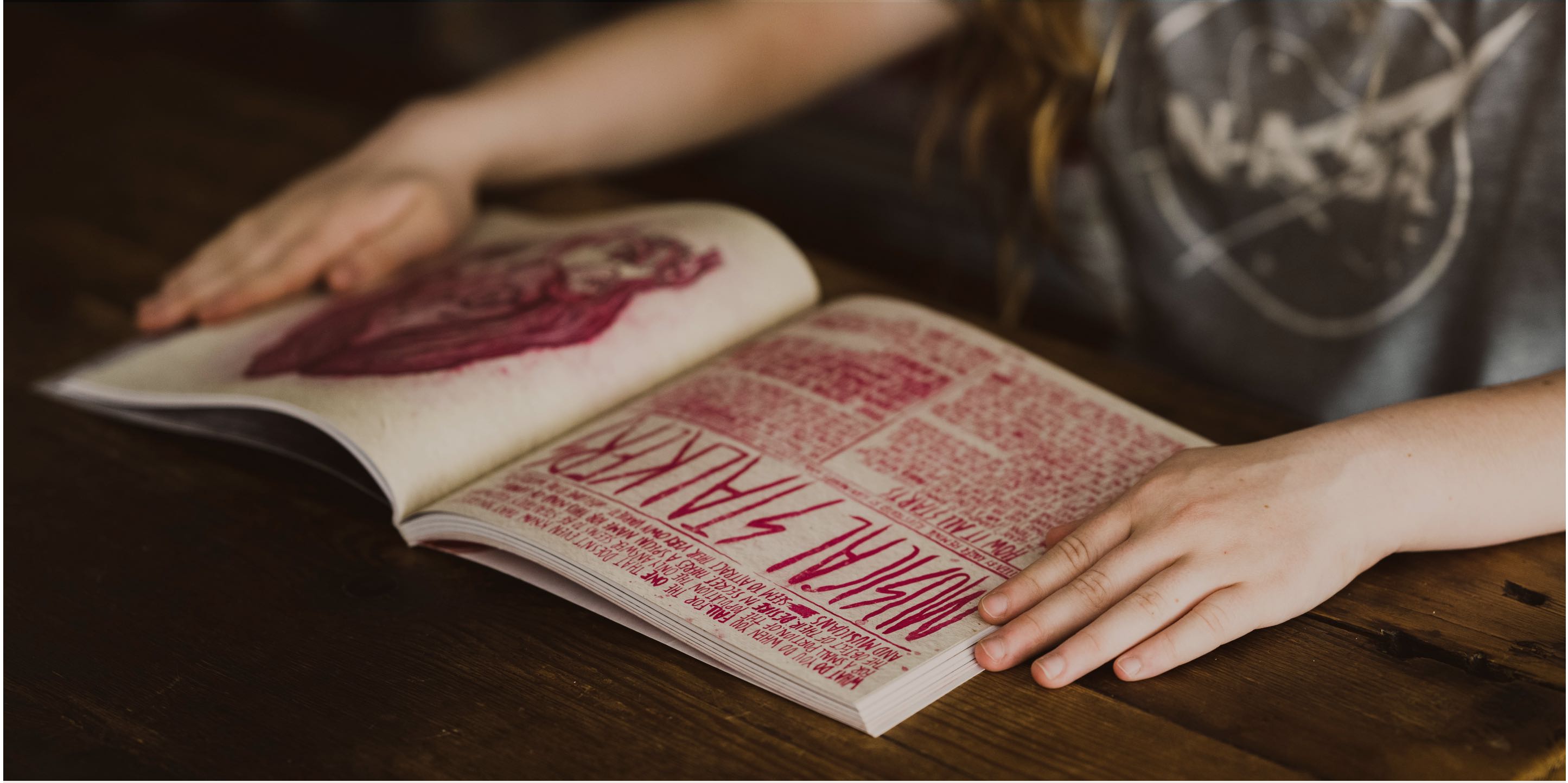
Welcome to the second half of our interview with Sarah Hyndman, author of Why Fonts Matter and creator of Type Tasting workshops. In Part I, Sarah shared stories of how she got into typography, how she arrived at the idea for Why Fonts Matter, and how she came up with Type Tastings. In Part II, we learn what makes for a great event and the many ways in which typography impacts our perception of different brands.
Can you tell me more about how your Type Tasting workshops have evolved over time?
Sarah Hyndman: They've evolved quite a lot! The workshops really depend on what people want. They began as really big, public events where people could be creative and – hopefully – fall in love with type. Now, the main workshops I do are for companies where I can add huge amounts of value, because I’ve done so much research in this area. Sometimes I’ll do workshops with their design departments, though not too often because designers already love type. We know a lot about it, and we're all quite geeky about it.
But the best workshops are the ones I do for entire companies, whether they’re law firms, publishing firms, or something else besides. And I’ll ask everyone to participate, and it’s really interesting for the designers to see how everybody answers different questions. It’s empowering for everyone when they realize, instinctively, that we’re all typography experts. Once everyone starts to compare their answers, they can see how similar their responses are, even though they aren’t designers and they don’t have that background. And that’s when I see a lot of “Aha!” moments, when attendees get really excited about type.
I still do both big events for the public and professional workshops. Though in the last year and a half it wasn’t possible to do big public events, so that evolution only happened very recently. Before COVID, I was creating really big installations and events, and I’ll get back to those in 2022. The last big public thing I did before lockdown was for Adobe MAX in Los Angeles, at the end of November 2019. And it was this huge, immersive, multi-sensory type booth featuring Adobe fonts, and you walked up to different booths and you experienced the fonts through sound, smell, touch, and taste. And it was only once you engaged with all of your senses that the mood of each typeface came to life.
Definitely pencil me in the next time you create a space like that, it sounds amazing! And that brings up a really important point, because you've had to evolve quite a bit in the last two years due to COVID-19 and quarantines. How have these shifts changed the trajectory of your professional development workshops and the types of companies you work with?
Sarah: I think it allowed my professional workshops to develop quite quickly. Before, I only had a certain amount of time to go into different businesses because I'm just one person. But as soon as I started doing these online, I didn't have any other distractions, because suddenly I wasn't spending three months building a big installation somewhere.
At the beginning it was quite a shock when a year's worth of work got cancelled overnight in March 2020. Like everybody else I spent two or three weeks sitting around thinking, “OK, so now what?” Everything I do is so interactive; I wasn’t sure how to transfer that experience to a virtual environment.
But then I realized I could send participants a list of objects to bring ahead of time, and I could curate the experience based on what they brought. And it became this really engaging experience, and that was enhanced by chatting with people in real-time through the platform. I love chat on Zoom, and now I want to find a way to incorporate that aspect of virtual workshops into my larger events. Even if I’m speaking to an audience of 2000 people, I still want to answer little questions along the way because it makes presentations so much more fun.
What ended up happening was, as we got deeper into lockdowns and I focused all my energies on virtual workshops, I ended up doing five or six every single week, whether they were public or privately booked. Over the course of a year, I had a chance to really perfect my presentation style while incorporating huge amounts of real-time feedback. Every time I finished one, I would go back and fine-tune the process for the next one, to the point where now I have this portfolio of workshops that I know works incredibly well, both online and in-person.
That's incredible how you've adapted your presentation style to the way our culture has evolved. You mentioned that you were looking for ways to make these virtual workshops more engaging and interactive. What are some examples of objects that you asked people to bring to these workshops?
Sarah: One of my most popular events is a gin and type tasting. I’ll send you a list of one kind of gin, one kind of tonic, and different things to smell, though you don’t have to drink to follow along with the workshop. And as we go through the history of different kinds of type, I’ll ask you to smell different things as you put them in your drink, and it brings that moment of history to life.
Another one is a drawing workshop, where you have a playlist, so you're listening to music and drawing things, and then everyone holds up their drawings and shares it with everyone else. The whole point is to show you that many different factors – including type and music – can impact your mood, and we can see that in the drawings.
Sometimes I ask people to bring their favorite branded product. That way all the workshop participants can compare how we curate the objects in our lives. And because everyone was at home, it meant they had easy access to so many different things, so the conversation evolved in ways I couldn’t have anticipated.
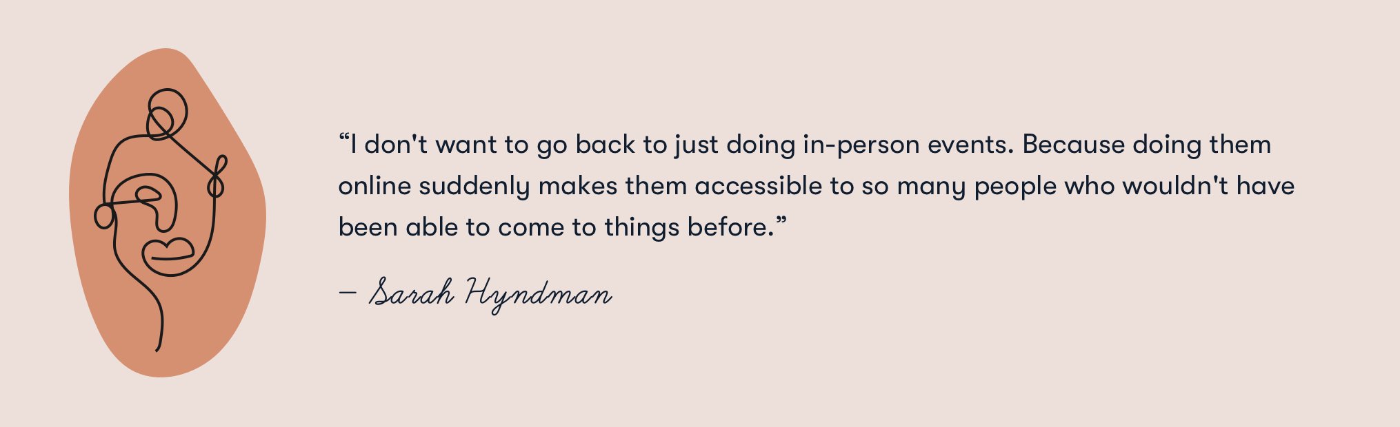
And that reminds me of two amazing things that came out of these workshops. At the beginning of quarantine, everybody was just looking for escapism, but then towards the end of 2020, people were getting quite lonely. So, I evolved the sessions to reflect that, and I added an extra half-hour or hour to our chat, like we were going to the pub together afterwards. And it meant that we would have a table of people from around the world who would never otherwise have met each other, people who came from completely different backgrounds. And we discovered just how much we had in common. I think it changed how a lot of us think about things, once we heard everyone’s opinions. And the other thing that I think is wonderful is just the accessibility. I don't want to go back to just doing in-person events. Because doing them online suddenly makes them accessible to so many people who wouldn't have been able to come to things before.
Now I want to come back to what I mentioned earlier, about asking people to bring their favorite branded products to a workshop. The idea is that whether we realize it or not, we curate the objects we surround ourselves with. There's a really famous story about the time Gap rebranded in 2010. There was an immediate uproar because people hated the new typeface. Specifically, people were saying, “It looks cheap and tacky, and it makes me feel cheap and tacky.” And it wasn’t just designers moaning about it. All kinds of people were saying “No, you make me feel different about the brand I love.”
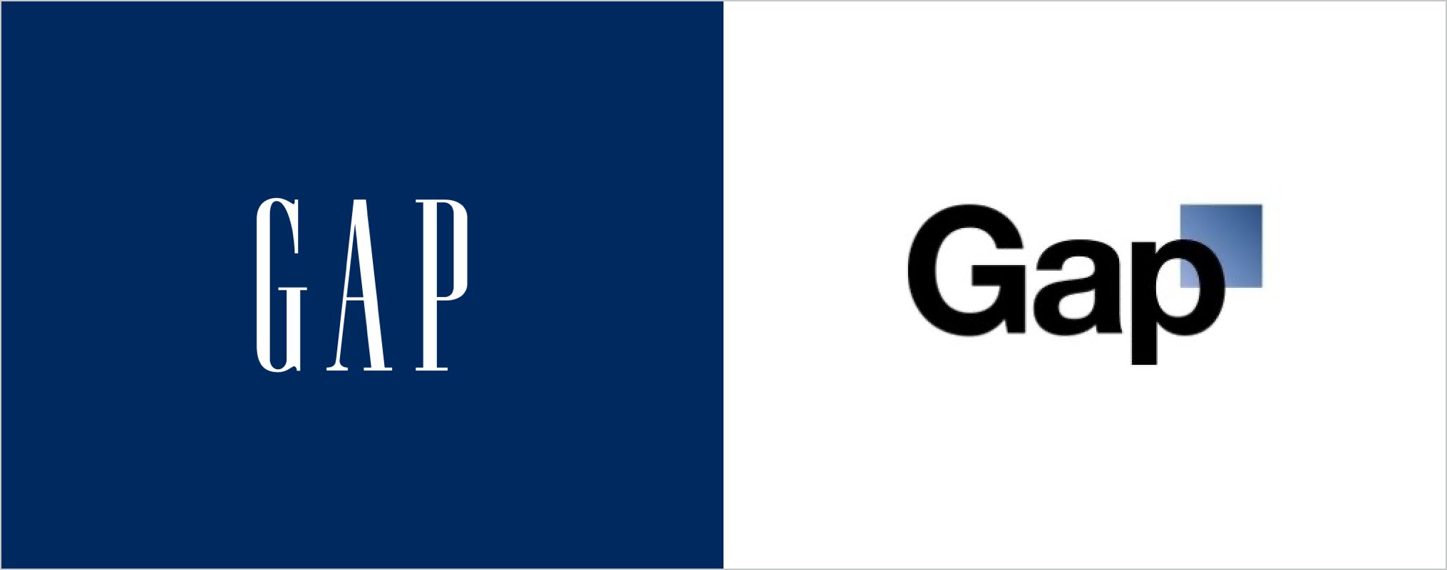
Left to right: current Gap logo, failed Gap logo redesign in place from October 9, 2010 to October 12, 2010
You bring up a really interesting point. There are many brands, such as Gap, that have been around for decades, and there are also tons of companies that were founded only recently. How well do all these companies understand the value of type in their branding? Do you think that’s common knowledge?
Sarah: I would imagine it’s spread out very unevenly. And not all companies rely on their choice of typeface, either. Google could rebrand in Comic Sans, and they’d still be Google because their reputation precedes them. I think there's a point when a brand is big enough, they can become a trendsetter. If they suddenly start using a really strange and unexpected typeface, they'll lead the way. Though it depends on the kind of company, as we saw with Gap.
But it’s different for smaller brands. If they don’t have name recognition, if they haven’t built a community based on trust, first impressions are everything. And type has a big impact on our first impressions of a new brand. If you’re in the supermarket and you’re scanning the shelves, you don’t have time to stand there and carefully examine every single item. And brands don’t have a lot of time to catch your eye, especially if they’re trying to make you switch your allegiance.
I think about that subconsciously every time I go in the store. If everyone plays it safe, all the brands start to look very similar. But on the flip side, you can't take too many risks, because then you might alienate people if your brand seems to be too disconnected from reality.
Sarah: Authenticity is also a huge factor. If an industry doesn’t keep pace with its customers’ values, every now and then the moment is right for a brand to suddenly jump into new territory. Take Lily’s Pet Food, for example. For the longest time the pet food market always looked very scientific and old-fashioned. And then Lily’s came along, and it looked more like organic food that you would eat yourself as a human being. And suddenly, once Lily’s decided to embrace their authentic nature in a fun, approachable way, the rest of the sector started to change really, really quickly. But it didn’t happen until someone was brave enough to take a risk. And it’s usually an idea that’s borrowed from one industry and gets transposed into another one, rather than something that’s completely new. Because that really would be too weird. I think now is the time when people are taking a few more of those risks, which is really quite exciting to see.
That’s really profound. Earlier, you described specific “Aha!” moments, when participants in your workshops compare their answers to certain questions and they realize they know quite a lot about type, subconsciously. Can you share any other “Aha!” moments from your workshops? When team members realize, “Oh, this is something I always took for granted,” or “Oh, this is something I've never noticed!”
Sarah: Yes, recently I was doing a workshop for a major publishing company. And somebody from their legal department suddenly exclaimed, “Oh my God, we need to redesign all our contracts.” And I got a message a few weeks later saying they'd realize they needed to take another look at the typography on their contracts. And something else I hear all the time, is when people say, “Oh, so I shouldn't just keep using lots of different fonts in my work emails?!? That's why the branding team keeps getting upset with me for doing that!”
Once we talk about trust and consistency, they start to get it, that it's not your personality, it's the company's personality. And whoever's booked me to do the session is usually sitting there going, “Yes! That's what we wanted you to take away from this.” And I see lots of people’s eyes light up when we talk about readability, and why font size matters. Make type larger! The coolest typefaces aren’t always the best ones to use. And then once the workshops conclude, people often send me photographs of different signs from their neighborhoods, and they remark, “This is just like that thing we were talking about. Now I understand why this is important.” And for anyone reading our interview who wants to contact me about times when typography has really woken them up, they can reach me through my LinkedIn profile.
That's awesome, receiving that kind of validation after the workshop is over. And when people go out into the world, and it’s like they have a sixth sense for type now. They’re wearing their font goggles, as you might say. And suddenly they understand why type looks a certain way in different situations. Can you tell us about your latest projects?
Sarah: I'm always juggling a number of different things. I’m starting to do more online workshops and I’m working on two new books now. One I’m really excited about but I can’t give you any details, only that it's gonna take forever to research. And then the other one is the ongoing one, where I'm collating all of the information that I've been gathering about typeface personalities. I want to compile all of that research into a book that everybody can use, but in a way that makes sense. And that will show how type evolves with time, as well.
Who in the design community and beyond has had the greatest impact on your life and the way you approach design?
Sarah: Early on, it was the designers that I worked with, brilliant senior designers who put up with me asking a million questions. And while there are amazing typographers out there, I’ve worked for myself for so long and it’s such a narrow little world that I try to look outwards as much as possible. For example, I’m really interested in how much typography is influenced by sign writing. But it’s not often acknowledged because sign writing is such an ephemeral craft.
Charles Spence has also influenced me. He’s a Professor of Psychology at Oxford and he taught me how to do the research for my books, and I’ve published a few studies with him. I’ve also been influenced by chefs, musicians, perfumers, and people who create exhibitions for a living. All of these people come from very different industries and they each have a very unique perspective. There are a lot of parallels with the connections I’ve made through virtual workshops. When I sit around the same table with people who come from all different kinds of backgrounds, and we talk about what we can create, we come up with really interesting ideas and we forget what we can’t do. That’s how I ended up creating that multi-sensory exhibition for Adobe MAX in Los Angeles. It all came together thanks to a collaborative effort from a wide range of creative professionals. It’s always been my focus to help everyone get out of their silos, to meet, listen to, and get inspired by as many different kinds of people as possible. The world is changing and we need to broaden our horizons. It’s incredibly valuable.
How you prioritize looking outside your area of expertise for inspiration? And how do you avoid getting stuck in a rut?
Sarah: I had been running my own design company for quite some time, and what really helped me was stepping away from that and asking deeper questions about my work.
When I started Type Tasting it was only meant to be for one year. And it was during that time I realized how many times clients had asked me, “But why does that type mean that?” And I would just say, “Because it does.” And I started to look at all these assumptions I had made without thinking about them, because that's what we do as designers when it gets passed down from generation to generation.
Asking questions, actively listening to the answers, and not filtering them through any expectations or assumptions. That’s what started me on this current path. Because when I found that if I really wanted to understand this question, I would have to backtrack and ask that question, too. Once you start nibbling away at your assumptions, I think that’s when you start to awaken your curiosity. And that’s when any subject can get really fascinating. Because if something’s not what you thought it was, then what is it? And how does that change everything else? The more people you talk to, the more opportunities you’ll have to unearth really profound questions. That’s what keeps me going.
What advice would you give to young designers in typography, and students who are just starting out?
Sarah: Find a way to fall in love with type. Don’t take it too seriously straight out. Find the thing that makes you really excited, that makes you want to learn more about it. So what if you break some rules? Don’t worry about it. It happens. Play with type, don’t be intimated. Find the people whose type you love, and try to talk to them. Most people are really open to a conversation. Once you really fall in love with something, that’s it, you’re set.
Finally, you’re juggling so many different projects right now, and I can tell you're always thinking of what’s next. If you had an extra 60 minutes in a week, what would you do with that extra time?
Sarah: I’d probably come up with loads more crazy schemes. What I should do is go to sleep for an hour, just get enough sleep, but I’d just fill it with more projects. Whatever time I have I’m busy exploring something new.
Typography is all around us, and each of us has an instinctive understanding of fonts. After all, we’ve been interacting with type all our lives. But this subconscious understanding doesn’t automatically translate into excellent branding or award-winning creative work. Far too often, the way we manage our fonts can disrupt the design process and lead to creative chaos.
In many organizations, fonts are scattered across individual computers, servers, and email accounts. And that means the design process is often blocked before it can get started. Research has shown creative professionals waste almost two hours every single day searching for the right fonts and digital assets. There’s a better way to work, but you need the right tools for the job.
Whether you’re a freelance graphic designer or the creative director of a global team, we have a font management solution that can help you create your best work. Put an end to your creative chaos and fall in love with your font collection all over again.