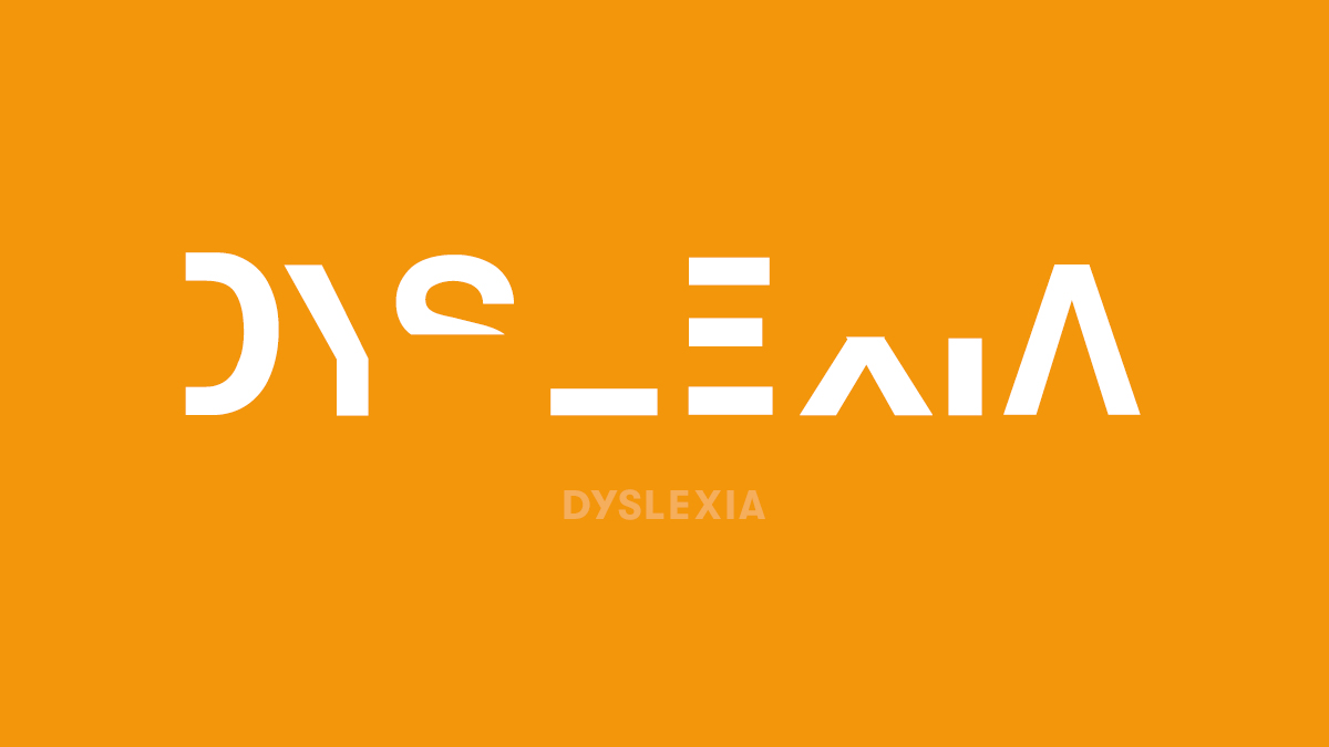
Dyslexia is a learning-based language disability that may affect close to 1 billion people around the world. Over and over again, visual deficits observed in people with dyslexia have been shown to be a side effect rather than a cause of this disability. And while a tremendous amount of research has been conducted on how to treat it, there’s one small detail that is sometimes overlooked. Since dyslexia primarily affects a person’s ability to read and spell, how does one’s font choice affect a document’s readability?
Before we dive in, if you don’t have dyslexia you might not understand how challenging this disability can be. If you want a glimpse of what it’s like to live with this disability, try reading this font. Only by understanding this disability can we take appropriate steps to treat it.
But what’s the best font for people with dyslexia? The answer may surprise you. As it turns out, the best font for people with learning disabilities is probably right in front of you. And it’s not what you think.
Perhaps no typeface in history has endured more blowback than Comic Sans. And while Comic Sans is frequently a subject of derision, many people with dyslexia see it as an oasis. What might surprise you is that no scientific studies have shown a significant improvement in readability from using Comic Sans.
Now, does this mean Comic Sans isn’t a good font for people with dyslexia? Absolutely not. People often cite the distinctive shapes of the glyphs in Comic Sans as the reason for its improved readability. Specifically, almost all of the letters in this typeface are unique – only the “b” and “d” are mirrored. This high level of irregularity might be what makes it easier for people to focus on the individual parts of words.
But that’s only part of the story. When Vincent Connare set out to create a new typeface for Microsoft in 1994, he wasn’t trying to design a font that people would love to hate. In fact, he wasn’t trying to create a new typeface at all:
“Comic Sans was NOT designed as a typeface but as a solution to a problem with the often overlooked part of a computer program's interface, the typeface used to communicate the message.
“There was no intention to include the font in other applications other than those designed for children when I designed Comic Sans. The inspiration came at the shock of seeing Times New Roman used in an inappropriate way.” - Vincent Connare, creator of Comic Sans.
Connare originally designed Comic Sans for Microsoft Bob, a sort of precursor to the infamous Clippy. Microsoft Bob was designed to show users how to operate Windows 95 through the use of a cartoon dog whose speech would be rendered in Comic Sans. The typeface didn’t make it into Microsoft Bob, but it was eventually included as a Microsoft system font, ensuring its widespread availability for decades to come.
Irregular characters and easy access have made Comic Sans popular among some people with dyslexia. But since Comic Sans wasn’t designed as a typeface — much less as a typeface for people with this disability — shouldn’t that leave some room for improvement? If Connare got close without even trying, could another typeface designer create a font that was even better?
Several typeface designers have taken up this challenge, with the following results:
Unlike Comic Sans, the creators of all these typefaces set out to design fonts that would be good for people with dyslexia. On the downside, none of these fonts is as widely available as Comic Sans. Connare’s creation rode the wave of desktop publishing, while all of these other fonts are much more obscure. And unfortunately, none of these fonts have been scientifically proven to improve readability.
Comic Sans is widely available and it already has fans among people with dyslexia. But what if you don’t want to use Comic Sans? What are some fonts that not only look good, but have also been scientifically proven to improve readability?
You don’t have to look far.
The best fonts for people with learning disabilities are probably on your machine right now. They’re widely available in Windows applications, macOS, and Adobe Creative Cloud.
The fonts are Helvetica, Courier, Arial, and Verdana.
In a classic study about which fonts are easier to read for people who have dyslexia, researchers found these three typeface characteristics significantly improved readability:
In this study, Helvetica, Courier, Arial, and Verdana came out on top in terms of both reading performance and subjective preference. Another key takeaway from this study is that italicizing any font severely decreases its readability. Something to consider before you design your company’s quarterly report in a 9 pt italicized serif font like Times New Roman.
A font can convey the voice of a brand by its design presence (ie: bold and strong, thin and fluid), and can also set the tone for every interaction with the public. So, when you design marketing materials for your company or develop new campaigns for your clients, pick a font that’s easy to read at both large and small font sizes. The typeface should never overpower the message.
As you research which font to use for your next project, please consider dyslexia-friendly fonts like the ones we’ve discussed. Though Helvetica, Courier, Arial, and Verdana have been scientifically shown to improve readability among people with dyslexia, there are many options in this category. Look for fonts that are sans-serif and Roman style, and then check to see if they’re available in monospaced versions.
Finally, don’t be too hard on Comic Sans. What might at first appear to be childlike or informal could in fact be someone else’s only option to make it legible. If someone wants to use Comic Sans and it doesn’t conflict with the needs of the business, let them. It could be a much bigger issue for them than it is for you.
In your future font searches, remember there’s no guarantee that every typeface with the same name will print or display the same way. Even minute variations between characters can affect kerning and tracking. Look for a font manager with exact font matching to prevent these types of font errors.