It’s almost as if Tré Seals was destined to become a type designer. He has loved letterforms since he was a young child — working diligently to make his handwriting match the sample text, selling graffiti-inspired index cards, and studying classical art.
When he graduated from design school, Seals went right to work and put in his time as a temp and a freelancer, with a strong focus on crafting brand identities. It was during one such project that that he realized something was missing in the design world. While there was a lot of beautiful work, it all seemed to be coming from a single perspective.
After reading the 1987 article Black Designers: Missing In Action by Dr. Cheryl Holmes-Miller, Seals became inspired to put his stamp on the design industry. In 2016, he launched his own independent type foundry Vocal Type Co.
If you thought that fonts had nothing to do with culture, think again. All of Vocal Type Co’s historically inspired typefaces are intended to preserve culture and diversify design. Each font has an incredible story to tell.
We caught up with Tré Seals to learn about his process and what led him to dedicate his career to purposeful typography.
When did you first realize you wanted to work in design, and what led you to design typefaces?
TS: I'm a firm believer that everything happens for a reason. So, when I look back on my life, I can connect the dots and see how one thing directly led to or impacted another.
My journey began at the age of 4 when I was diagnosed with a brain tumor. After the tumor was removed, drawing and writing became my means of coping with the pain. When I got tired of drawing, I'd practice writing in cursive until I could get my handwriting to look like the sample sheets. And then, four years later, a residual tumor was found. That's when everything changed.
I stopped drawing pictures of basketball players and skateboards and started drawing pictures of Venus De Milo, Greek columns, and David (until I realized that I could make money doing what I loved).
In the 5th and 6th grade, I would graffiti people's names on index cards and sell them for $3 apiece. I designed bead jewelry, Lego™ jewelry, tattoos, and more throughout middle and high school.
But during that time, I also started a three-year-long personal project. During my senior year of high school, I started drawing what would become the basis for my first typeface. I didn't know anything about type design back then, but I knew that I'd be capable and would release it to the world one day.
In your mission statement for Vocal Type Co., you bring up issues around diverse design perspectives. Would you tell us a bit of your perspective on homogeny in the industry, and why we need more representation of BIPOC designers?
TS: I think it's all pretty straightforward. When a single race and gender dominate an industry, this creates a lack of diversity in peoples and experiences and ideas and creations. For example, most designers (pre-2020) go to college and only learn about design from a European perspective. As a result, it's hard to find work that is not just "good" but unique. And from an economic perspective, the more our work begins to look the same, the less valuable our expertise becomes. With more BIPOC representation comes a greater number of perspectives, more unique creations, and the greater our industry's value.
Creating your own foundry is a big step. What led you to make such a bold move?
TS: In May of 2015, I graduated with seven job offers ranging from art director positions at startups to a Pepsi junior design position. I ended up taking a full-time position at a staffing agency where I worked for 8 or 9 companies over the course of 2 years. I learned a lot about what kind of designer I wanted to be and what types of clients I wanted to work with. After that, I went full-time freelance and started focusing on renovating the stable that is now my studio.
One day, I was working on another brand identity for another real estate agency (I did a ton of those as a temp). As usual, I was aimlessly searching for inspiration, and all of a sudden, I just got really bored. Everything looked the same to me. No matter how beautiful, everything looked the same. There was no character, no culture. I started wondering if I had chosen the wrong career.
Not long after that, I came across this 1987 article titled "Black Designers: Missing In Action" by Dr. Cheryl Holmes-Miller. In it, she talked about how, like most industries, the design industry is white male-dominated. If our job (as designers) is to communicate an idea to Black communities, Black designers need to have a seat at the table. And I say the same for Latin communities, Female communities, LGBTQ+ communities, and so on. Everyone needs to have a seat at the table. The world continues to become more and more diverse, and the industry needs to catch up.
A few weeks after I read this article (2016), Cheryl released a sequel for the original article's 30th anniversary, "Black Designers: Still Missing In Action." This version was less analytical and was her way of passing the torch to the next generation of Black designers. It made me want to figure out a way to, somehow, add diversity to the design industry.
I looked back on my life and thought about those days of practicing cursive, graffitiing people's names on index cards, designing tattoos, making Unveil; it just made sense to start a font foundry.
And in thinking about diversity, I had to think about my racial experiences. Like the times I experienced racism and bigotry in the workplace, or when I got stopped by four cops in Minneapolis, or the first time I was called the' N' word, or the first time I experienced racism. However, I also had to think about my positive racial experiences. Like the pride I felt when learning about Dr. King, Bayard Rustin, Eva Peron, Ruben Salazar, Dolores Huerta, Nelson Mandela, and many others who have left this earth better than they found it.
That's when I realized that type could be more than just a design tool, but a tool for educating and sharing stories like this one. That's why I decided to add a piece of minority culture to the root of any great piece of graphic design—typography.
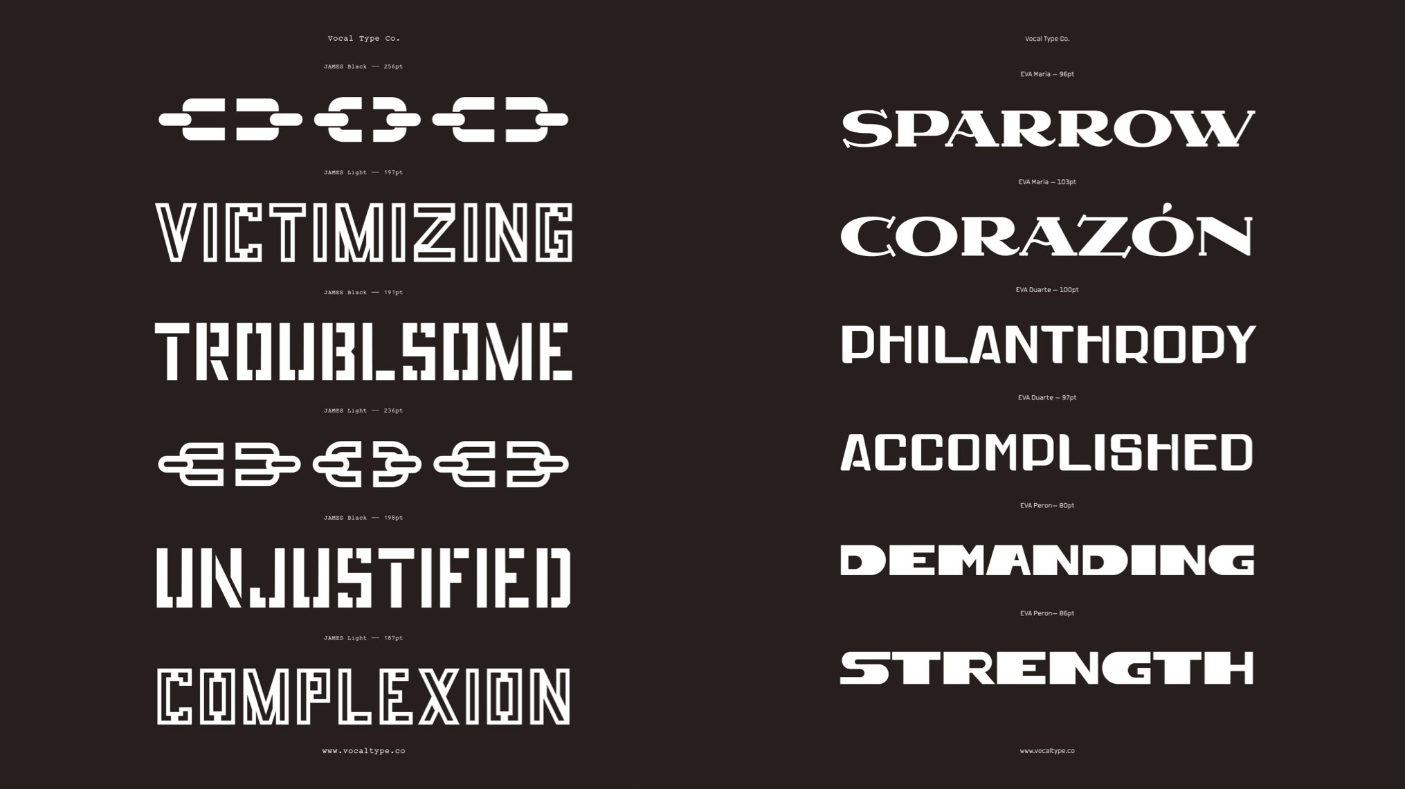
JAMES Typeface // EVA Typeface by Tré Seals
Many of our customers are graphic designers, so we know how important finding the "right" font can be. Before or after you started designing typefaces, did you ever have a creative project where finding the right font was a game-changer?
TS: Before becoming a type designer, finding the right font was always a game-changer. I'm a firm believer that everything happens for a reason. Because of that, I believe that every design decision should have a reason.
So, when I'm working on a brand identity, color, graphics, and type combine to play a huge role in telling a brand's story.
I love how your typefaces allude to history. Can you tell me a little bit about your creative process? Where do you get inspiration? Do you start with a font creation program or on paper? What does iteration look like in your process?
TS: My process is 25% research, 25% design, 25% research 25% design in a broader sense. This allows me the opportunity to see things from a fresh perspective. I might see something that I missed during the first round of research that proves to be helpful.
The result of this process involves three parts that are pretty much interchangeable. For example, let's say I want to make a font based on a particular movement. Once I've identified the movement, I'll start searching for specific events associated with that movement. From there, I'll start looking for some sort of typographic ephemera that multiple people have a connection to.
You might notice that I never make a font based on one signed that one person has a connection to. It might be one sign that hundreds of people carried or a banner that ten people carried. It reinforces the importance of unity.
Lastly, I'll identity an activist, to name the font after, that connects to the chosen movement and event. But the starting point can vary from project to project.
All of your fonts are beautiful, and many have been used in some pretty unique projects. Are there any which have been used in ways that have made you especially proud?
TS: Martin is hands down my most popular font. And it has claimed a space outside of the Civil Rights Movements and in the Black Lives Matter Movement. In 2020, Martin was used for everything from protest signs to non-profit brand ideas to street murals.
Then there's Bayard. Bayard was inspired by this double-sided hand-painted sign that stood outside of the headquarters for the 1963 March On Washington For Jobs and Freedom. This is where Dr. King's famous "I Have A Dream" speech was given. For the 2020 Virtual March On Washington, which took place on the same date, Bayard was used to create the entire brand identity, website, merchandise, signage, and social media graphics. To me, that’s what bringing history full circle looks like.
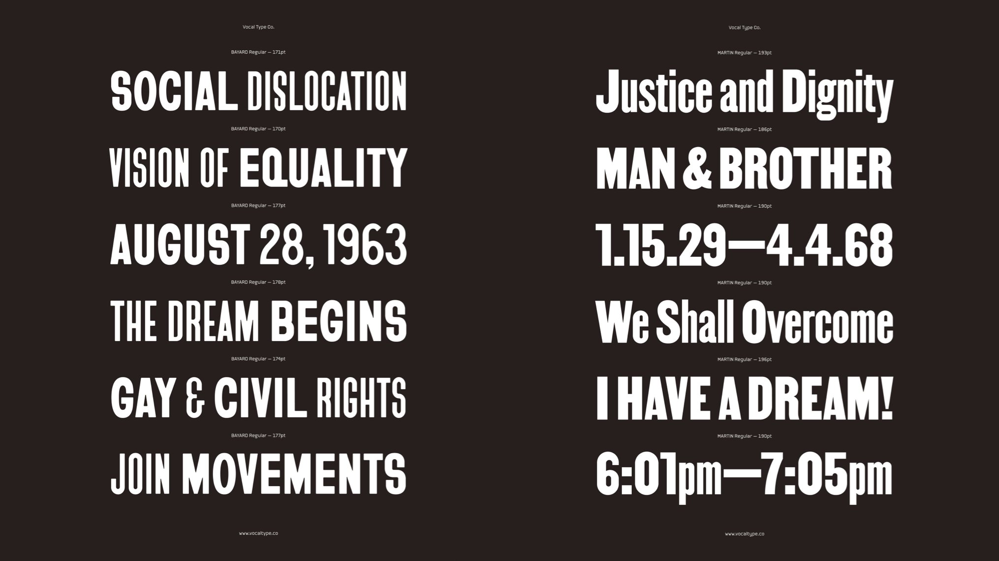
BAYARD Regular // MARTIN Regular by Tré Seals
Can you tell us a little bit about your latest project? What are you working on now?
TS: I'm putting the finishing touches on the William font family. William is inspired by this series of infographics design by renowned author, sociologist, and activist W.E.B. Du Bois for the 1900 Paris World Fair. The infographics portray how the institution of slavery was hindering progress in the Black community. It is my largest font family to date with 27 fonts total, three weights, three widths, with matching italics and reverse italics.
Then there's Ruby, a multilayer 3d font family inspired by a font with a pretty crazy history between France and the U.S. that I'm hoping to release as a display companion to William.
There's Sadao (name TBD) inspired by Japanese internment during WWII, Wang (name TBD) inspired by a protest banner carried during the uprising at Tiananmen Square, and I'm working on rebranding Vocal with a brand new site. There's a lot of exciting things coming this year.
Can you name any specific artists that have had a big impact on you, your life, or your career? How and why?
TS: Scott Thares, Andrea Pippins, Tal Lemming, Gail Anderson, Maurice Cherry, and Dr. Cheryl Holmes-Miller have been huge influences on how I design and, more importantly, where I fit in the industry.
I attended college at Stevenson University and majored in Visual Communication Design. Every year, the department would host an Aristocrat's-In-Residence program, where a creative (designer, coder, photographer, etc.) would do a lecture and host a three-day workshop. In 2014, the A-I-R was Scott Thares, the owner of a design studio in Minneapolis. After doing his workshop and sending a thank you note, Scott offered me an internship. I jumped at the opportunity, moved to Minneapolis for the summer, and got 65% of my design education in 2 months. However, what he said to me on my last day had the most significant impact on my career. He said, "wherever you work, don't be a wrist." He explained that a wrist is a designer whose creativity (ideas, voice, etc.) is controlled and censored by their boss. They are hired to move their wrists and nothing more.
Now, whether or not Scott is a sorcerer, I don't know. But since that day, every time I took a design position where I was unknowingly becoming a wrist, my wrists would start hurting. And the longer I'd stay, the worse the pain would get, eventually turning into carpal tunnel. But once I finished that contract or quit that job, the pain would immediately go away. I can't thank him enough for that gift (or curse).
Then there's Andrea. She was one of my professors at Stevenson University. While I was only able to take one of her classes, it was in that class that I realized that type could convey different attitudes and emotions and that designing from a cultural perspective that most of the design industry doesn't understand is an advantage.
And it was because of her that Gail Anderson was also an artist-in-residence at SU. While I did attend her lecture, I didn't get to meet her until 2019, when I designed some promotional graphics for her talk at The Washington Post. She's been a great help ever since.
Tal Lemming also gave a lecture and put together an exhibition at Steven University. That was the first time I ever saw the type design process and everything that goes into it. That's something I continuously look back on when I think about everything that has led to the creation of Vocal Type.
As for Dr. Cheryl Holmes-Miller, aka "auntie," she's the person that inspired me to start Vocal Type Co. When I first started learning more about diversity in design, I came across her 1986 article "Black Designers: Missing In Action." Not long after that, I read the sequel released in a 2016 issue of Print called "Black Designers: Still Missing In Action." I was so inspired after reading that article. So much so that I contacted her a week or two later to get her opinion on the idea of Vocal Type. I'll never forget, she said, "you better do it before someone else does." I can never thank her enough for that.
Last but not least, Maurice Cherry. When I started Vocal, I'd asked creatives of color and designers involved in diversity and inclusion for their opinion on the idea, and the responses varied between "try it, see what happens," and "you don't know enough about diversity and inclusion to do something like this." But Maurice was different. After Cheryl, he was the first person to see the value in what I was doing and the first person to give Vocal any actual press. I can't thank him enough for everything he's done.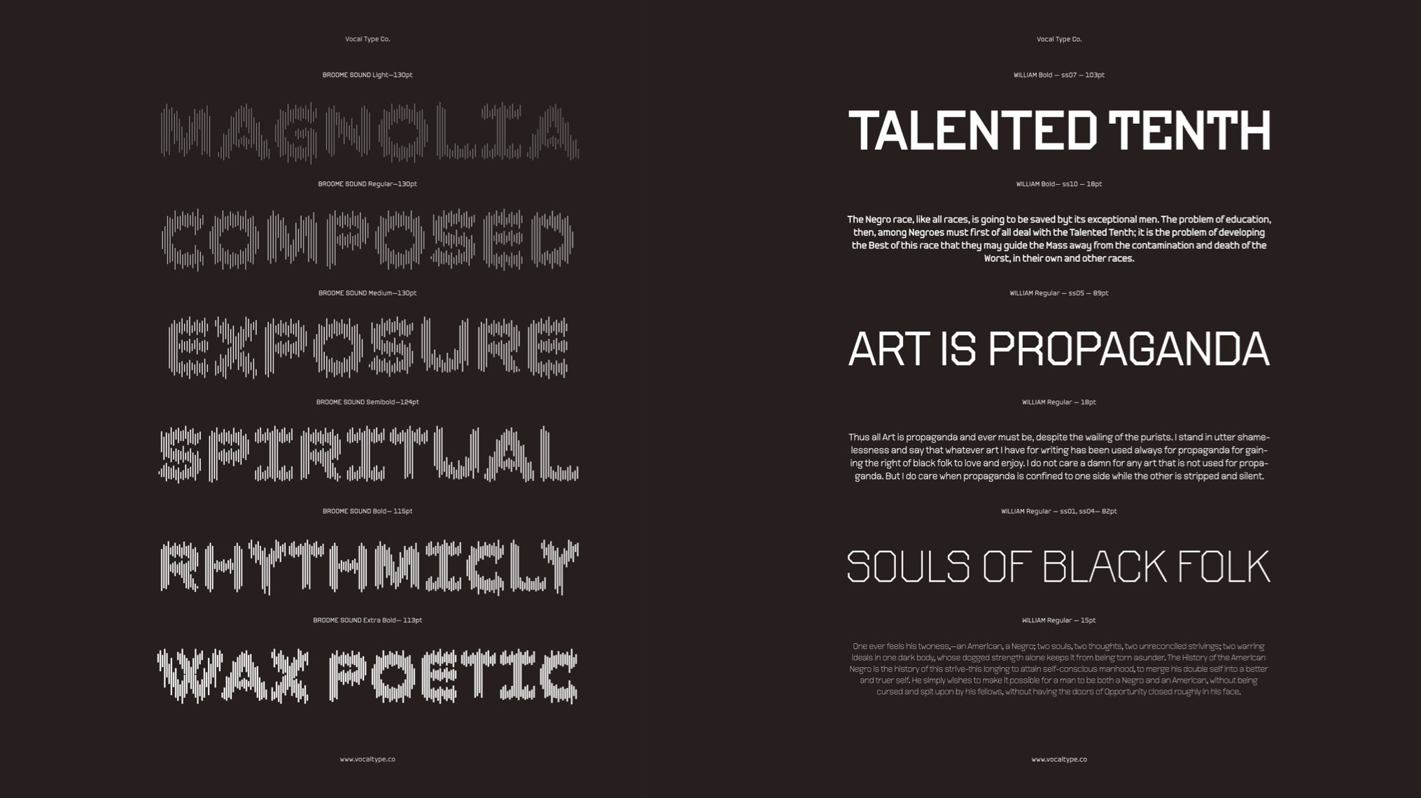
BROOME Sound // WILLIAM Typeface by Tré Seals
What advice would you give to young designers just starting out?
TS: I would say that the best designers aren't only interested in design.
I would say that everything happens for a reason, and so should every design decision.
Don't be a wrist.
If you had an extra 60 minutes in a week, what would you do with that extra time?
TS: Sleep.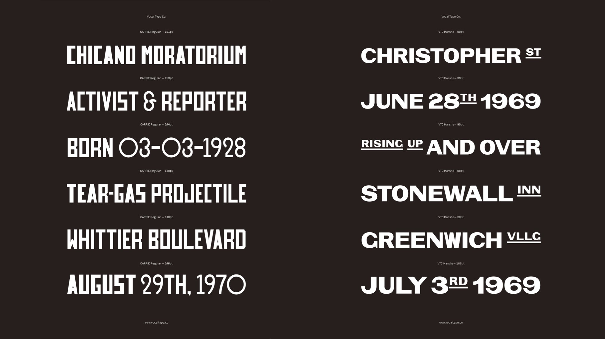
CARRIE Typeface // VTC Marsha by Tré Seals
Is there such a thing as too many fonts? Only when your collection grows beyond your control. Thankfully, designers can use auto-activation to always find the font they need, when they need it.