Type design is a discipline that truly embodies skillsets required in both design and fine art — functionality is crucial to a successful typeface, even if it means cutting corners on aesthetics. Whether a type designer is replicating organic handwriting or digitizing an indigenous alphabet, balancing readability and making an artistic statement can be a real challenge.
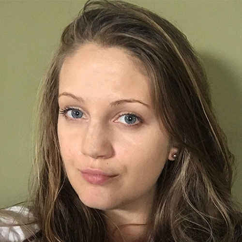
Jo Malinis is a Manila-based type designer who will not compromise. Her typefaces are stunning statement pieces that are just as functional as they are beautiful. Jo also practices graphic design, illustration, and brand identity work, in addition to teaching at UP Diliman College of Fine Arts. She’s been a force for community activism as well — launching a font to benefit Manila’s design community and founding Type63, a platform that showcases typography by Filipino designers.
We caught up with Jo to learn about her approach to designing fonts, strengthening the Filipino design community, and her inspirations.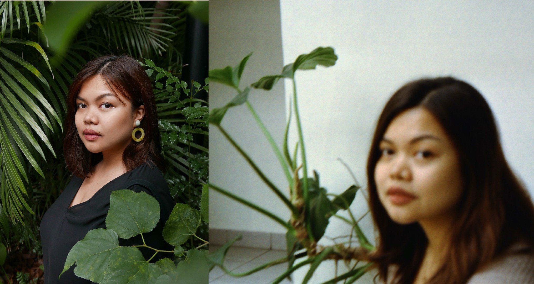
When did you first realize that you wanted to work in design, and how did you get involved in type design?
JM: My parents both work in creative fields. My mom's an editor and my dad's a graphic designer. So, it kind of came naturally to me that I wanted to work in the creative field as well. I got into design after I finished a degree in Fine Arts, and then type was something that I discovered along the way by accident. I got assigned a project in the studio and I had to create a custom type for the brand that I was working on. That was the first time that I had to do it. So, you know, I was jumping into something that I had no idea how to do. And it's been one of the best decisions that I've made.
Can you walk me through your process for designing typefaces?
JM: It always starts with inspiration and I find that it's hard for me to work on something without inspiration. I look for that first. Then I supplement that with research. Then, I’ll start sketching, and after like a bunch of sketches, that’s when I start to do digitization. I’ll jump into Photoshop or Illustrator to try and figure out the vectors before I go to Glyphs and figure out how it can work as a workable typeface. And then afterwards, it's that process of forever iterating, fixing all of the forms, and revising and adding all of the finishing touches before I export the font to a typeface that is actually usable.
And there will always be a round of tests that come with it. That’s when it feels like an infinite loop. But after I get out of that period, that's when I tried to create specimen materials that can help present the typeface properly. Actually, during the whole process, I've been thinking of how to present that typeface, so it always goes hand in hand. Then, I just put it out there and then hope for the best.
I noticed that the Hook typeface (which, by the way, I’m obsessed with) was inspired by the “hook” of a song. I also checked out your social media Instagram and it’s obvious you really love music. What role does it play in your design process?
JM: Well, for me, even before I started working on type, I’ve I found that I really can't work on any project without listening to music. I can't work properly without music. I usually have a certain album that I’m listening to, or a playlist that I work with. I assign a playlist to each project, so I use that to keep me productive while working on that specific project.
I like music, mostly because of how it makes me feel — like the lyrics, the melody, and the background story of the artists all comes into play. But the most important part for me is how it makes me feel and how I react to it. I can't really explain it, but it's what triggers my imagination to go wild. And it actually serves as the best inspiration for me to turn something that abstract into something more concrete and more visual.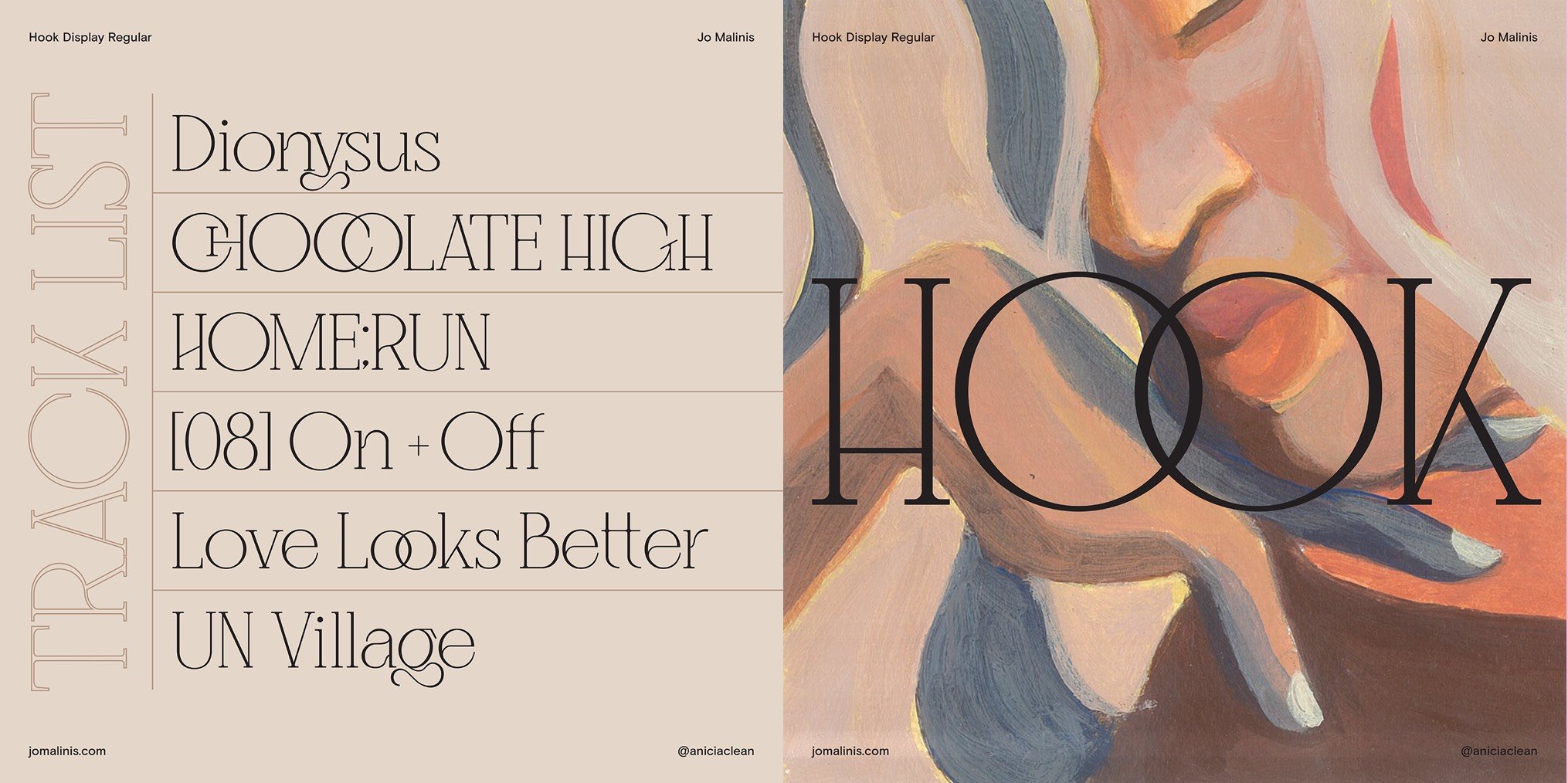
I love how you’ve used your work to give back to your community. I’ve written about Salbabida Sans before, but would you let our audience know a little bit about this typeface in your own words: how it came to be, and the impact it allowed you to make?
JM: Salbabida Sans is a project that I worked on last - I actually forgot the date! - I think around last November, after the two super typhoons struck the Philippines and a lot of people were devastated. Among those were my friends Pau and Dyam of Bad Student Press, which is a risograph printing company here in the Philippines. They're the only riso printing company here that focuses on the art prints. They've actually supported the community so much by collaborating with different designers, and their impact on the whole community and especially the design community has been massive. So, when that happened to them, it felt like not just a blow to them, but a blow to everyone.
When I saw my friends trying to raise funds for them to get back on their feet, I wanted to do something as well. A lot of my friends sell their prints and artwork, but I didn't have any of those things at the time because I don't usually work with prints. So, I wanted to create something that was very natural to me (like a typeface), sell it, and give all of the proceeds to Bad Student Press afterwards.
The first forms of Salbabida Sans, were actually stuff that I've been experimenting with for a while. My first drawings of the letters existed way before, but when that typhoon happened, that's when I just completed all of the characters and brought the typeface to life.
The name actually came after because I'm not a good copywriter, or a good writer at all. So, I asked for some of my friends’ help. I just told them that, “Oh, I want a name for the font to be related to how the forms are like lifeboats, life vests, and like inflatable water floaters.” And one of my friends actually suggested the name Salbabida, so that's what we went with.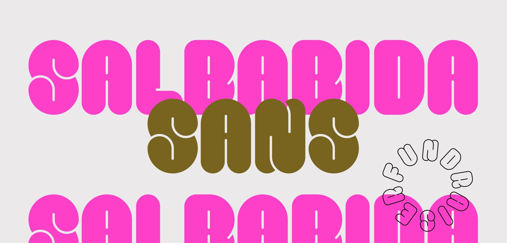
In July 2020, you launched Type63, a fantastic initiative to get eyes on the incredible and often overlooked work of Filipino type designers. Can you tell me a little bit about what inspired you to set Type63 in motion?
JM: Well, I mentioned that I got into type design by accident. Here in the Philippines, there are no programs that focus on type, and so all of my knowledge came from my research online. As I was getting more into type design, the number one thing that I had a hard time with was finding people to talk about it with, especially locally. I was only exposed to a few people because they were friends of friends. But apart from them, I knew no one. And I felt like that's kind of impossible. I don't think I'm the only one who's working on type in the whole country.
It also didn't help that when I look for type design work online, I'd rarely see work made by Filipino designers.
Then, I came across FEMME TYPE’s Instagram account and saw how they would feature female type designers and female designers who focus on typography. And that's what actually made me think, “Oh, I wish we had something like this.”
When I talked to one of my friends about it, he told me, why don't you start it yourself?
It was never an idea that I thought was possible. But really, there just needs to be someone in your community to start it. And I feel like that was my role at that time. I just made an Instagram account because it was easy, you know, it’s basically just logging in with an email and creating an account. Then, I just hoped for the best.
The response has been incredible, and it's been going on ever since.
Do you have any design heroes who inspire you?
JM: Locally, there's my mentor. His name is Dan Matutina. He's also my boss at the design studio that I work with called Plus63 Design. He is an illustrator and an amazing graphic designer who also received a Young Guns award. I look up to him not only because he's amazing at what he does, but also because he's very generous with his time and his knowledge. That has been very impactful for my growth as a designer.
This is also the same reason that I look up to another designer called Felix Ng. He's Singaporean and he co-founded a studio called Made By Anonymous based in Singapore.
Felix and Dan are both really great designers and very, very generous with all of their knowledge and their resources.
As for type design, I really look up to the foundries Klim Type Foundry, Grilli Type, and Ohno Type Co.
You teach design at University of the Philippines Diliman College of Fine Arts. What’s your approach to teaching?
JM: I'd like to be able to offer a close mentorship to my students where I figure out what their strengths are and help them improve on those. It's just a bit hard to do that now in the pandemic, when everything is online. But I try and I hope that it’s working.
Many of our customers are graphic designers, so we know how important finding the “right” font can be. Before or after you started designing typefaces, did you ever have a creative project where finding the right font was a gamechanger?
JM: I can't think of one specific project because I feel like all of them rely heavily on the tone that the typefaces set. Since I work on brand identity projects a lot, it's very crucial to find the right typeface that can set the right tone for the brand, because it's going to be what the audience will see first. Especially for logo projects that really only rely on the typefaces, like logos without icons or marks that really rely on the type, it’s always crucial to pair them with the right typefaces.
What are you working on right now and what’s next?
JM: Right now, I am trying to finish a work in progress typeface called Terno. It’s based on a traditional dress here in the Philippines that has accentuated butterfly sleeves and I want to try and embody that and the font. So, I'm working on that right now and will hopefully get it finished within the year.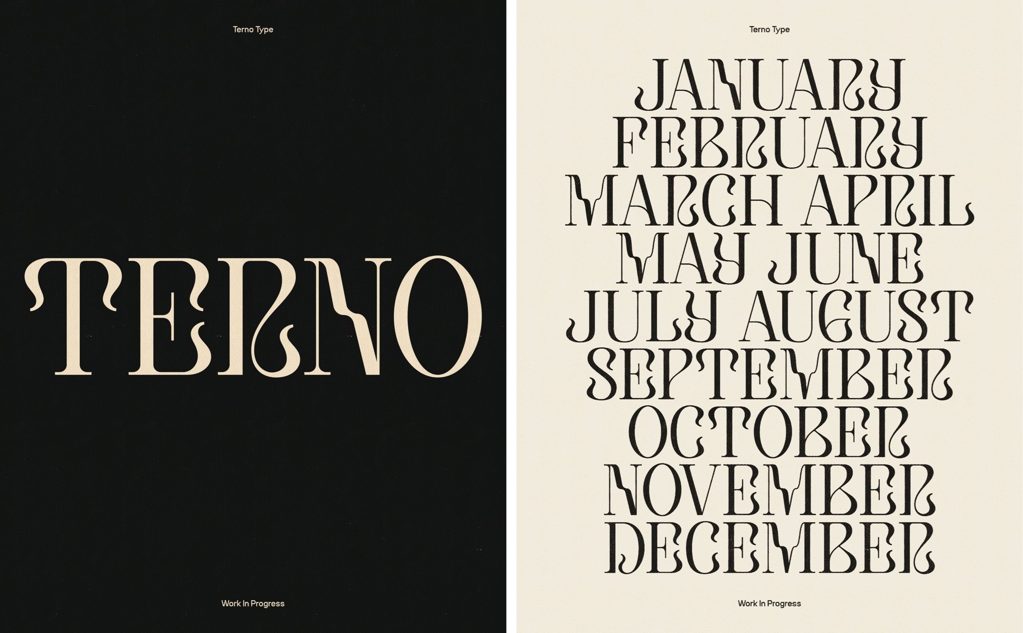
If you had an extra 60 minutes in a week, what would you do with that extra time?
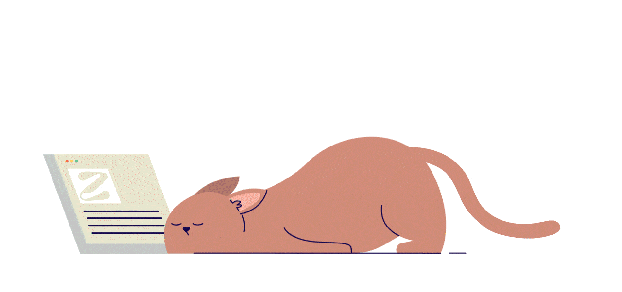
Honestly, just sleep. I feel like even if we're working from home during this pandemic, it's the one thing that I still have a hard time doing. So, if I had an extra hour in my life, I'd really just dedicate it to sleeping.
Do you have an all-time favorite font?
It's good that you mentioned “all-time” because I feel like my favorite typeface always changes during with the seasons. But there are two that I come back to — Newzald and National by Klim Type Foundry.
They have a special place in my heart because they're the fonts that got me exposed to the world of type foundries. And when I discovered type foundries, I was able to understand the process of creating them through those foundries’ blog posts. It was very eye-opening for me, and those fonts had an influence on me creating my own typefaces as well. They’re some of my biggest inspirations.
If you collect fonts for your design work, you’ll want to have a well-organized, easily accessible collection so you can always find the one you need, when you need it. Using a font manager can put you back in control of your font collection, so you’re ready when inspiration strikes.