I used to hate handwriting fonts. They looked clunky. The spacing and kerning were always off, and very few handwriting fonts had alternate letter forms — the one element that could’ve made it look (at least a little) more realistic. I sensed that most of them were based on a poor handwriting sample to begin with, then made worse when outlines were rendered without expertise.
So, when I was approached to develop a handwriting font for the landscape painter Tony Foster to use throughout his book, the project didn’t interest me at first. Then, I started thinking.
Just because other handwriting fonts were lacking, didn’t mean that they all had to be that way. And if I created one, it couldn’t be that way. I accepted the project, undertook a challenge, and began a long journey to discover what makes a handwriting font look authentic.
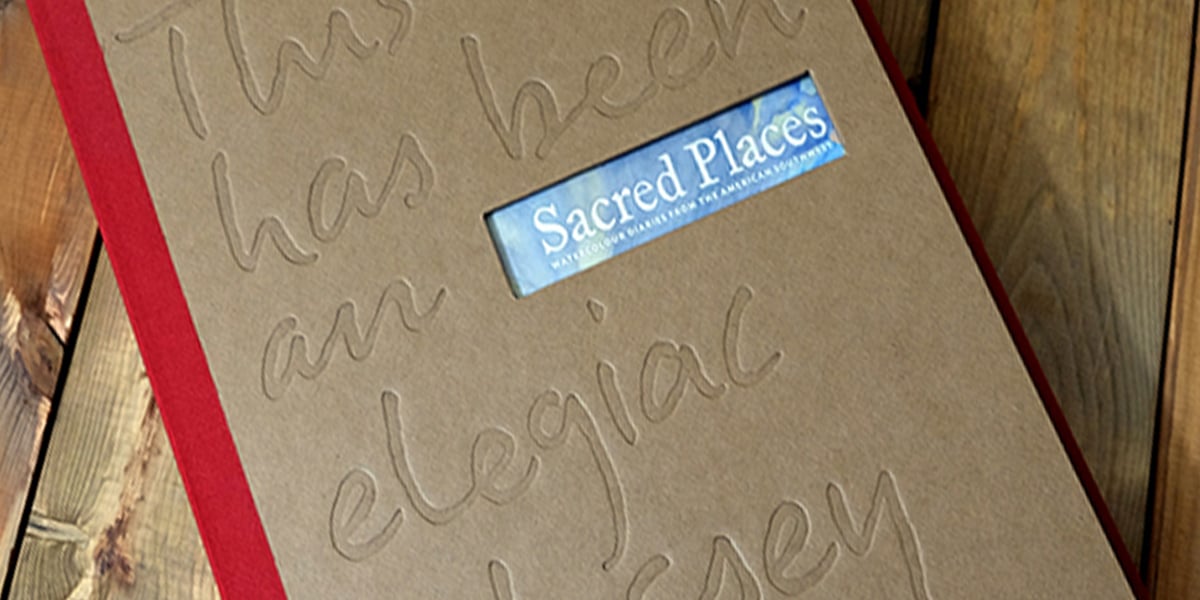
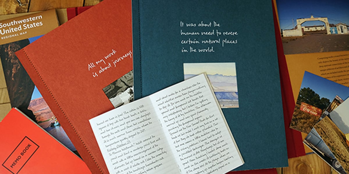
Tony is known for his handwritten notes that accompany every painting he has created. These were an essential component of making this book feel personal and complete. Handwriting is unique to the individual, but the actual little things that make it unique are practically universal.
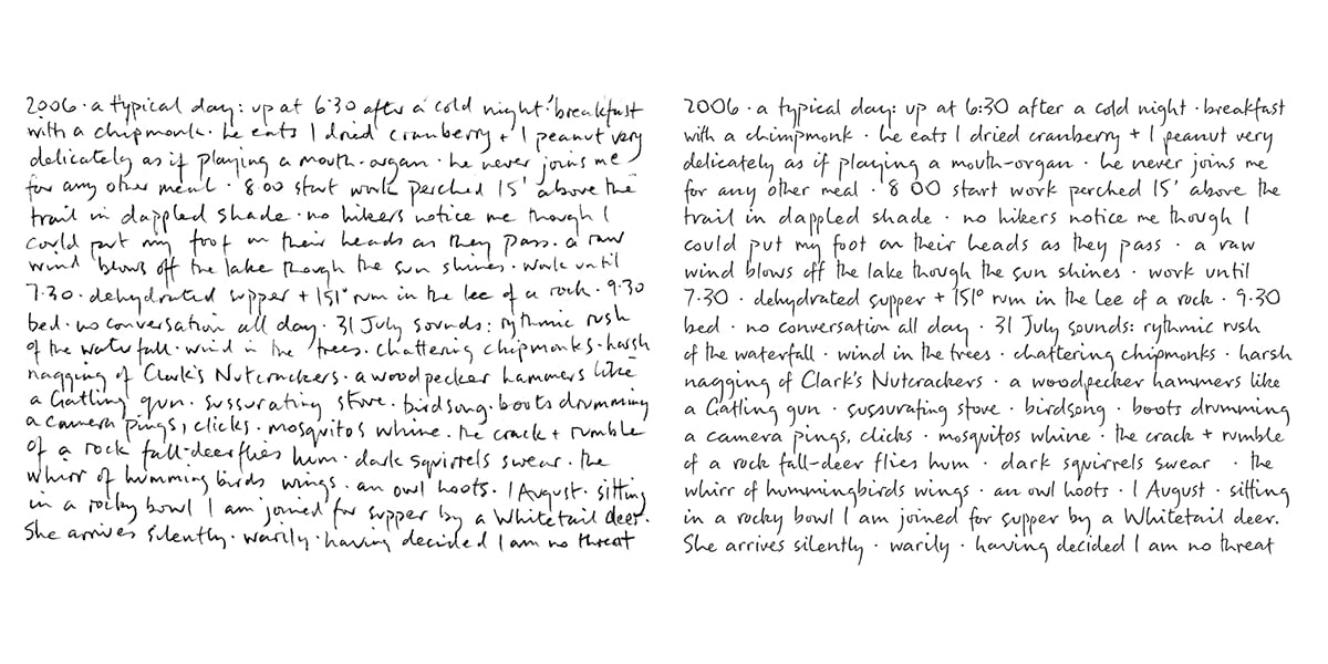
As I studied Tony’s handwriting, I immediately found that, like many people, he had a semi-connected handwriting style. Also, many of his letterforms often changed their appearance entirely depending on adjacency. There could be four variations of a letter, depending on where it was written — the beginning of a word, end of a word, middle of a word; connected or unconnected to another letter.
To recreate his handwriting into a typeface, I’d need to:
I typed up everything Tony had written from his handwriting samples and indexed it. I then developed a letter frequency guide to determine how many variations of each letter I’d need. The rest was time-consuming but fairly easy to complete.
When I delivered the final typeface, I got great feedback — and I’m pretty sure that Tony himself appreciated not having to handwrite a bunch of entries for his book. But what I was proudest of was the beginning of a process that could truly understand and replicate an individual’s unique, handwritten script.
I’m intrigued by how people handwrite in general – teaching hand lettering to over 2,000 people only encourages this obsession! When a similar project came up, I was delighted to be able to continue my work.
When approached by St. Jude Children’s Hospital to develop a series of handwriting fonts for its internal use, I immediately agreed to the project. I was excited to see what else I could learn, what additional processes I could develop, and if my findings could be applied to my own typefaces in the future
To extract complete handwriting samples from this wider pool of handwriting donors, I needed to develop a serious intake template.
I began with “Kern King” — a testing string that the typeface designer Leslie Cabarga assembled and gifted to the type community. It’s excellent for testing fonts, but I wasn’t sure how many of the letter combinations it contained.
In my opinion, a person’s handwriting is as unique as their fingerprint. Therefore, everyone has individual ways of connecting letters and writing letter variants, depending upon context. I needed the handwriting samples to contain as many letter combinations as possible to fully capture what made them unique.
After further research, I identified all of the two and three letter combinations found in the English language. My goal was to include the top 95% of these combinations when obtaining handwriting samples. With the “find” tool in Microsoft Word, I’d search for each combination and if it didn’t exist, I’d add in a word that used it.
The resulting sample text ended up being 480 words long. It also took about 35 minutes to handwrite. My assistant Dai Foldes had an idea — the sample text could be improved if it read more like a story as opposed to a long string of words.
At first, I rejected this idea. After all, it would take some kind of genius to write a document like this — with its cumbersome requirements of letter frequency and variations, along with numerals, punctuation, diacritics, symbols, and still tell a story, while taking no more than 40 minutes of the handwriting time. But, Dai made a compelling argument: it would likely elicit a better handwriting sample, which would lead to a better typeface in the end
Suddenly, it dawned on me. I happened to know someone with the creativity, attention to detail, superior grasp of the English language — the sheer brilliance required to take on and complete this project.
My older sister didn’t study for the SATs, but only missed four questions on it. She holds a degree in technical writing from the University of Washington. She loves solving puzzles of all kinds, and I’ve often said that she is the perfect person to have in an escape room with you. I asked my big sister if she would be willing to tackle this puzzle with me because I don’t know of anyone else who could have done it. She accepted.
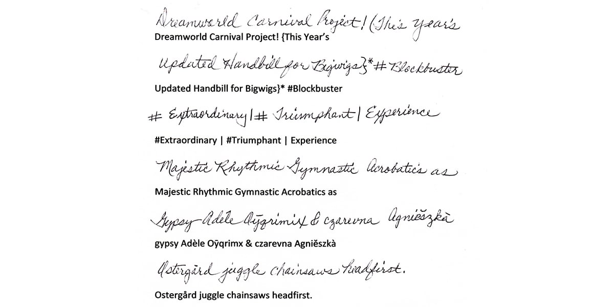
A mere 60 hours later, she sent me the first draft of a masterpiece titled Dreamworld Carnival.
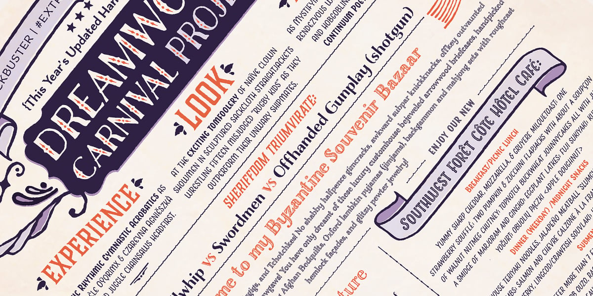
Dreamworld Carnival contains 95% of all the two and three letter combinations found; at least three examples of all upper and lowercase letters; in addition to numerals, punctuation, the most common symbols, and diacritical marks. In addition, I added in the top 100 most used words in the English language. It’s also delightfully written — check this out this excerpt:
“Please no Dummkopfs, Obnoxious Crackpots, Diehard Nihilists, Hellbent Killjoys, unruly muckrakers, swearing or kvetching. {You know who you are.} Misdeeds and laxness will be keelhauled and shipwrecked onto an island ever afterward!”
This document changed everything for me. Dreamworld Carnival now serves as the sample text I can provide to elicit a complete handwriting sample. But beyond that, it’s also an excellent tool to for creating and testing my typefaces.
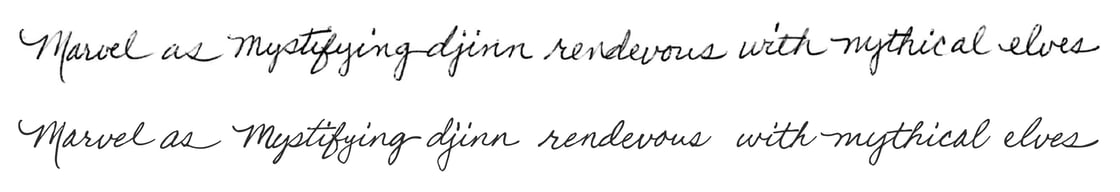
While I’m not at liberty to share the 14 typefaces I developed for St. Jude Children’s Hospital (maybe someday), there is one handwriting sample and resulting typeface I can show you.
This is my mother’s beautiful penmanship, turned into a font (bottom row) and given to her as a Christmas gift, along with a sample from her actual handwriting (top row). I’m sure she never imagined that her daughters’ skills would come together to create such a unique gift.
As I look back, I see the failings of older generation handwriting scripts. They were based on the idea of handwriting, of what everyone and anyone’s handwriting might look like. But the truth is that handwriting is inherently defined by the individual who creates it.
Awkwardly squished e’s, grandiose and flourished q’s, the totally different relationships between different letters as they form different words — these things don’t just make handwriting personal, they are what makes it beautiful. My goal has been to empirically replicate that, and it’s been an incredibly rewarding journey.
 LAURA WORTHINGTON is a typeface designer from Washington State. After training and working as a graphic designer since the mid ‘90s, she turned her lifelong fascination with lettering and typography into a business, publishing her first typeface in 2010. She has since published more than 100 typefaces and designed custom faces for Fortune 500 companies. Laura’s faces are based on her own hand-lettering and calligraphy, a practice she continues to hone daily. You can explore her typefaces at Laura Worthington Design.