Choosing the right font style can be a time-consuming and difficult challenge. Typography experts estimate that there are over 30,000 font families to choose from. Yikes!
So…how do you find the RIGHT font/typeface in an endless sea of options? Some basic guidelines might help.
RULE 1. KNOW YOUR FONT CLASSIFICATIONS
It’s a lot easier to find the perfect typeface if you have a working knowledge of the basic categories being used in design today. According to fonts.com, there are four distinct classifications (Serif, Sans Serif, Script, and Decorative) with 15 unique styles.
CLASSIFICATION A: SERIF
STYLE: SERIF OLD STYLE
This category includes the first Roman types, originally created between the late-15th and mid-18th centuries. Bembo, for example:
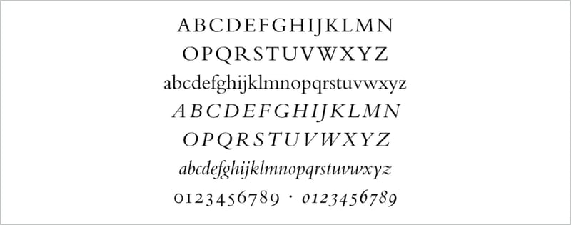
Bembo Font
STYLE: TRANSITIONAL SERIFS
These typefaces represent the transition between old style and neoclassical designs, and incorporate some characteristics of each. E.g. Americana
STYLE: NEOCLASICAL & DIDONE SERIFS
When first released, these typefaces were called “classical” designs. However, it became apparent to printers that these were not updated versions of classic type styles, but altogether new designs. Bodini Classic
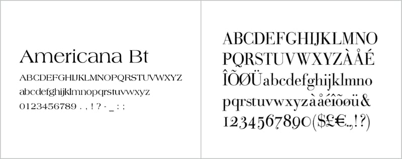
Left to Right: Americana, Bodini Classic
STYLE: SLAB SERIFS
Slab serif typefaces became popular in the 19th century for advertising display. These typefaces have very heavy serifs with minimal or no bracketing. Rockwell
STYLE: CLARENDON SERIFS
Clarendons were designed as bold faces to accompany text composition. Bookman
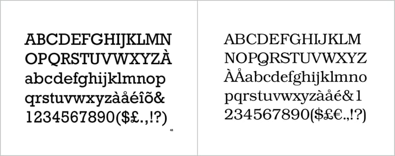
Left to Right: Rockwell, Bookman
STYLE: GLYPHIC SERIFS
Typefaces in this category emulate inscriptions rather than pen-drawn text. The distinguishing feature of these typefaces is the triangular-shaped serif design. Albertus
Albertus Font
CLASSIFICATION B: SANS SERIF
STYLE: GROTESQUE SANS SERIF
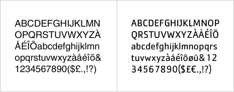
These are the first commercially popular sans serif typefaces. Contrast in stroke weight is most apparent in these styles, there is a slight “squared” quality to many of the curves. Helvetica is an example:
STYLE: SQUARE SANS SERIF
These designs are generally based on grotesque character traits and proportions, but have a definite and, in some instances, dramatic squaring of normally curved strokes. Cachet
Left to Right: Helvetica, Cachet
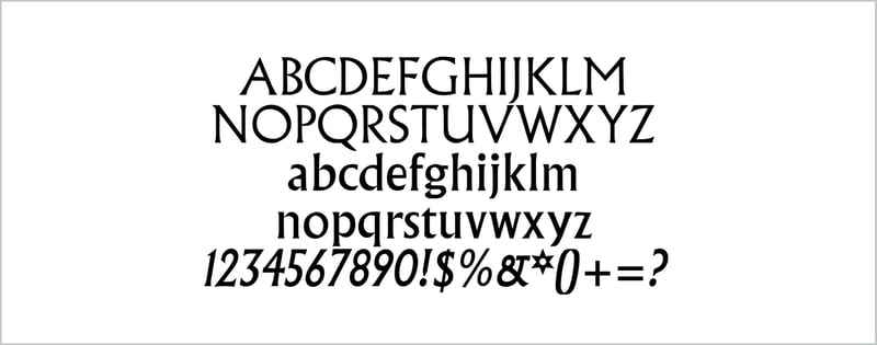
STYLE: GEOMETRIC SANS SERIF
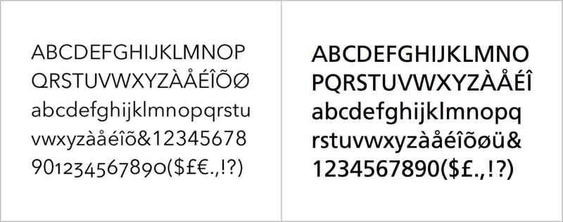
Simple geometric shapes influence the construction of these typefaces. Geometric sans tend to be less readable than grotesques. Avenir
STYLE: HUMANISTIC SANS SERIF
These are based on the proportions of Roman inscriptional letters. These are the most legible and easily read of the sans serif typefaces. Frutiger
Left to Right: Avenir, Frutiger
Serif fonts have “feet”, sans serif means “without feet.”
CLASSIFICATION C: SCRIPT FONTS
STYLE: FORMAL SCRIPTS
These typefaces are derived from 17th century formal writing styles. Many characters have strokes that join them to other letters. Bickham Script
Bickham Script Font
STYLE: CALLIGRAPHIC SCRIPTS
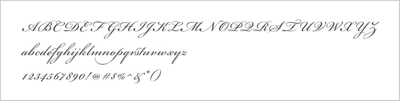
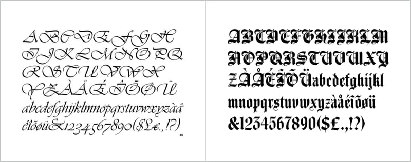
These scripts mimic calligraphic writing. They can be connecting or non-connecting in design. Many appear to have been written with a flat-tipped writing instrument. Vivaldi Script
STYLE: BLACKLETTER AND LOMBARDIC SCRIPTS
These typefaces are patterned on manuscript lettering prior to the invention of movable type. Agincourt
Left to Right: Vivaldi Script, Agincourt
STYLE: CASUAL SCRIPTS
These typefaces are designed to suggest informality, as if they were written quickly. Many times they appear to have been drawn with a brush. Brush Script
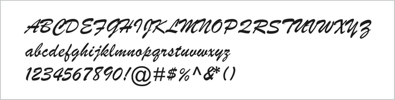
Brush Script Font
CLASSIFICATION D: DECORATIVE
Rarely used for lengthy blocks of text, decorative typefaces are popular for signage, headlines and similar situations were a strong typographic statement is desired. Who doesn’t love Mo Funky Fresh?
RULE 2. DON’T MAKE IT ALL ABOUT YOU
Smashing Magazine’s Dan Meyer advises designers against choosing fonts/types that make bold statements about their unique perspective.
“Many of my beginning students go about picking a font as though they were searching for new music to listen to: they assess the personality of each face and look for something distinctive that expresses their particular aesthetic taste. This approach is problematic because it places too much importance on individuality.”
RULE 3. MAKE SURE IT’S LEGIBLE
Bogdan Sandu at DesignYourWay says “many factors need to be taken into account when considering the legibility of the text—character shapes, size of counters, character width, weight, ascender, and descender length and stroke contrast.”
“The typeface should not overpower the text as this may distract from the message. The purpose of the typeface is to make the text easy to read.”
AVOID AT ALL COSTS
Ever wonder which fonts designers hate? Bored Panda did a hilarious Worst Fonts Ever article. Complex did, too. Both are good snarky fun (unless you’re a staunch advocate of Papyrus or Comic Sans).
We recently completed a Trends in Typography survey which contains feedback from designers about which fonts to stay away from.
And just for giggles, here’s an amusing cartoon.
CONTEXT IS EVERYTHING
There are no hard, fast rules about which font is the appropriate choice for any given job. But the designer’s first priority is always to engage the audience. So it’s extremely important to know what story you’re trying to tell and who you’re telling it to.


