Design can have a major impact on how we experience the world, and how we absorb information. For Daniel Britton, a London-based type and graphic designer, the goal is to communicate different experiences, present unbiased information clearly, and fully incorporate design history into his work.
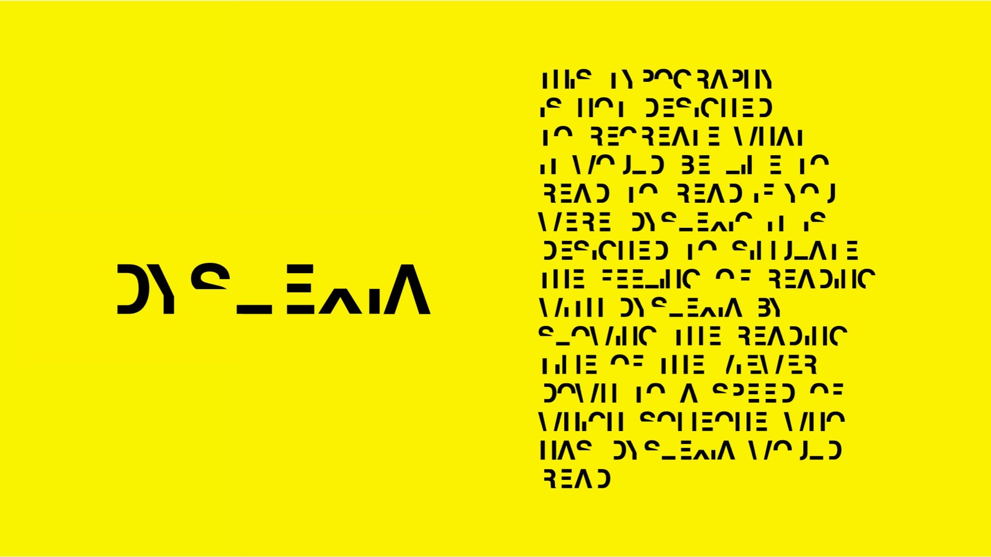
We first discovered Daniel Britton’s work when we were looking into which fonts are easier to read for people with dyslexia. Daniel created the widely celebrated Dyslexia typeface, which recreates the dyslexic reading experience for people without the condition. He also juggles working in an agency with managing private clients, critiquing students’ work, studying type history, and creating some of the most gorgeous infographics we’ve ever seen.
We caught up with Daniel to learn about his approach to design and how the creative industry has changed since the start of 2020.

Daniel Britton
When did you first realize you wanted to work in design?
DB: First off, to be quite honest, there wasn't anything else I could do. It was just one of those things. When you’re dyslexic, as I am myself, your options become a lot more limited – the tools you can use, what you can study. English was definitely off the cards, as was maths, and ten other subjects.
But I always got on well with design. I was always going to be, you know, either a graphic designer or a plumber — there was no in-between.
We discovered your work because you had designed this really fascinating dyslexia typeface that mimics what it's like for someone with dyslexia to experience reading. My mom is dyslexic, and I definitely have way more empathy for her not reading my emails all the way after looking at this typeface. But most of your work has primarily been focused on branding, information design and visual strategy work. What inspired you to take on creating the dyslexia typeface?
DB: The dyslexia typeface was created at university. We have something over here in the UK called the SIT, or a “self-initiated project.” You know, go ahead and have at it, show what you can do.
So, I created the typeface at university. My teachers liked it, but it was one of those things that just sort of sat in my back pocket for years and years and years, until it became time to go get a job somewhere.
The reason that the dyslexic typeface is known is quite funny. I was working in a studio called SomeOne in London with lovely, lovely, lovely people. I was a hopeless intern there at the time, you know, drinking all the beer and turning up late to work and doing all the things that interns do.
I really wanted to get noticed. I had the idea to try and get into a magazine. I thought, if my boss notices me get into a magazine, I'll get kept on. And so, I just very cheekily sent my dyslexia piece into designboom — you know, the biggest publication for design ever. [laughing] I mean, this genius over here thinks he's got a chance to get in designboom. And you know, lucky enough, I did. And it went everywhere.
And I still didn't get to keep my job. But we've got a nice typeface out in the world, so it's all okay. That's just what happens when you're 23 or 24, however old I was.
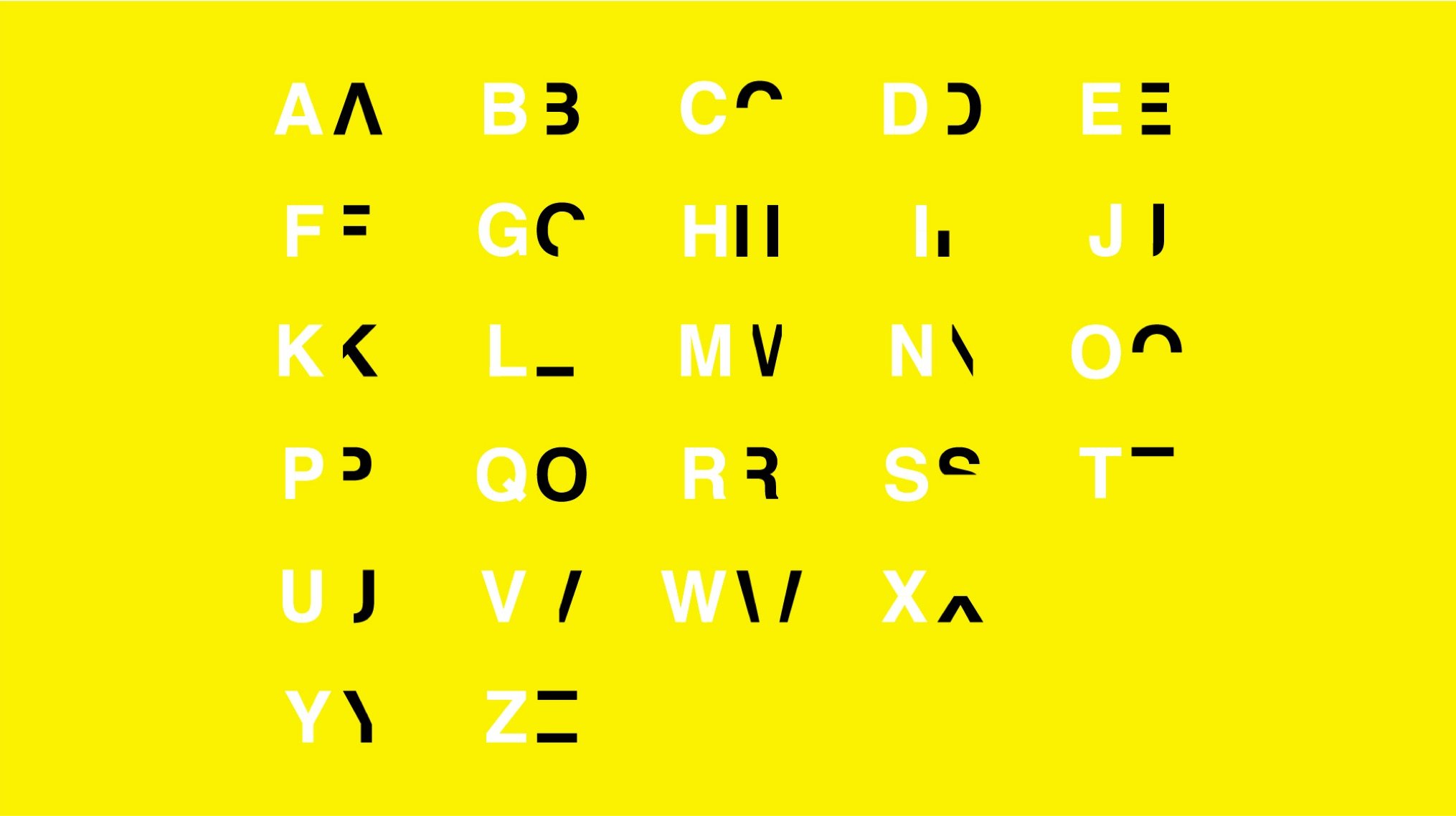
Dyslexia Typeface by Daniel Britton
Can you walk me through your process for designing it? I know that you know, a lot of type design is very hands-on, but once you start actually trying to digitize it, you need to use certain tools.
DB: I think everything starts with pen and paper.
You know, I don't understand designers today and I critique some work at the OCC every now and again, which is a university in London. I see this new wave of designers that are coming into the studios who are dealing with a temptation. The temptation is to go straight to the computer and start designing off the bat in Illustrator, After Effects, or whatever crazy programs they’re using.
The way that I do it is the way I got taught by my tutor Hamish Muir, who is another typeface designer. He forced us to really, honestly do everything in paper first. Photocopy things. Cut things up. Move things around by hand. Everything was done by hand first, and then you perfect it in a program.
I think it's a better way of doing things because you allow for more “accidents” to happen. You know, sometimes you can have a very happy accident when physically holding things, and you go “well, that's quite nice” or “let’s explore that.” All of my work was sketched first, then put into Illustrator to separate all the layers. And then afterwards, you know, After Effects and other things to make it look cool. But it was essentially just pen and paper and Illustrator.
What kind of responses have you received to the dyslexia font?
DB: Well, when the typeface first came out, I got absolutely flooded with interviews and whatever. And once the newspapers got their stories in, there was an even larger wave. Parents from all over the world were contacting me about their child's dyslexia, about how to push forward.
I've lived with dyslexia for 31 years. You struggle, you cry, you can't work things out, and it’s tough. But when you see other people going through it, there's a palpable atmosphere when you speak to somebody about their child's education. It's so, so intense because it's so important.
I've been working with parents like that all over the world. They either speak in English and we can just use Zoom, or I have to do things through Google Translate to speak with ladies in Chile.
We work a way around situations to help their children, and the response has been overwhelmingly positive.
There's this one young lady in Texas who is about 12 years old and severely dyslexic, and she picked up my typeface and showed her mother, “That's it, Mum, but that's exactly it!”
And the mom goes, “What's it?”
Then she starts writing in the typeface.
I didn't quite grasp what she meant at first.
What she had to do was hand in a report on Shakespeare or whatever for English, and she wrote pages and pages and pages in the typeface.
She asked me to read it back to her and I said, “I haven't got a clue what it says.”
It's a very, very overwhelmingly positive response to the typeface. It's all fantastic and it's definitely helped change the tone of the conversation when it comes to dealing with this disability, so it's very, very, very good.
Dyxlexia Typeface by Daniel Britton
Do you have any design heroes who have inspired you or are currently inspiring you? Are there any other creatives that you've noticed doing work to bring awareness to challenges and diversity in the design experience?
DB: It's just a never-ending list. You know, there's so many good designers out there.
I think my favorite studio is North: Shawn Perkins, his studio. I mean, the level that they pursue in their projects, the execution, the concepts, everything is just perfect. It's so, so perfect. And it's so timeless, every single time. They don't go for the contemporary touch, it’s this timeless graphic design every single time.
That’s my benchmark, the sort of standard I hold myself to when I do my own work. Obviously, I don't surpass it or reach it, but it's what I have, in the back of my mind every single time I’m working on the computer, thinking What are those guys doing? How are they doing it?
Having said that, you've got some fantastic studios on your side of the pond as well. You know, Collins is absolutely fantastic again, you know, very, very, very good stuff. But in terms of designers that raise awareness, I think you've got to give it up to Studio Dumbar over in Holland, they've done an effortless piece of graphic design – very touching, very emotional. Those guys are the ones to look out for.
You're not just a type designer, you do a lot of other graphic design work as well. And one thing that I really love are your infographics. Yours are very slick, very modern, and really design-centric. Can you tell us a little bit about your approach to creating them?
DB: Thank you. That's really nice because it's, actually not so well known, the infographic sort of thing. They seem to always be sort of like an afterthought, but I really do center a lot of my attention around infographics.
The reason I love infographics so much is that, unlike statements that you can put into a newspaper or an interview where you can bend the truth, you’re dealing with just data.
I go to what we have over here called the ONS, which is the Office for National Statistics.
They have multiple streams of government data. What I do is I go in, take that data, and refine it all to make it more palatable for your average Tom, Dick and Harry sitting at home that wants to be informed about the topics of the day, but doesn't want to have to sit on a government website for hours on end.
I’m trying to put in that legwork because nobody should have to put in that amount of legwork to just, you know, cut to the truth of what's going on. My infographics really come from this sort of political sphere.
There's not an ounce of truth in here any party is saying you know, everything is bent, everything is manipulated. People on the left are talking nonsense, the right are talking nonsense, the center, we're talking nonsense. It corrupts democracy and it corrupts people's trust in the system. In my own small way, I really wanted to put a stop to some of it and do my bit.
I produced a series of infographics around election time so that people can see the real top ten issues that are going to affect your average person. I want them to be to be able to find out exactly what is going on, in a way that’s very palatable, hopefully beautiful and easy to digest. That's what those infographics are about.
2019 General Election Infographic by Daniel Britton
Have you ever had an experience where finding the right font has made a big difference on a project?
— How convenient, it lives on your coffee table always!
— Next to the polished cup that I hope you will admire! (laughs) That's Paul McNeil's The Visual History of Type. To my shame, I've only bought it recently. My tutor Hamish Muir told me about it in university, seven or eight years ago. I kept meaning to buy it, but I never got around to it until about a year ago. And it's completely changed the game! It's fantastic when can you look at typography in a historical context, and you can start pairing typefaces to eras and deeper meanings, rather than just “I like this typeface.” It changes how you look at typefaces, you know. What is that typeface saying? Where does that come from? How has it been used before? What association does it have? What other typefaces does it look like? You know, the book goes into a whole plethora of meaning, but it’s very, very simple. I call it the Type Bible because it’s a complete game changer.
I think every single designer should have both of those books. Your work will instantly benefit from them.
This last year has been crazy for everyone. In terms of collaborating with teammates and meeting client's demands, how have 2020 and 2021 been different and how has your process changed?
DB: You know, for me, it’s not changed very much. I have two jobs.
My nine-to-five is with a fantastic agency in London, and I really, really enjoy spending my time there. We’ve always used Slack to communicate, so there's really no difference in whether you're over the other side of the room, or if one of us is in Greenwich and the other is in Waterloo. You can equally be in Barcelona, you know, designing on the beach, why not? You know, it hasn’t really changed because once you get into a studio, it’s heads-down working a lot of the time. You're sending messages from one side of the office to another and not communicating verbally, so it doesn't really matter the distance that's in between you and the next person.
A lot of people are working from home now, including my private clients. Everything's done over Slack, or Zoom, or Google Hangouts, or whatever it is. So really, I haven't really noticed a change in how I work, but what I have noticed is an increase in efficiency regarding that, you know…. that dumb thing where you've got to go right over to the other side of London for a meeting, or you've got to wait for the clients to come in, and get the biscuits out, and get the coffee ready. The whole rigmarole of having clients in the offices, you don't have to do that anymore.
I really love the informality of it. Because when you go to meetings and you put on your best suit or your Chanel No. 5 and high heels, that’s a front. It’s a front and I hate it. No one speaks like that when they're speaking to their friends or their mother or whoever.
But look at this. [gestures around apartment] You can see here, this is the flat, I have a friend working in the background over there. Your guard has taken down a bit and it all just becomes a bit more personal. You know, I prefer that touch. For me, it’s better.
But having said that, I really do miss Friday night beers after work. That's a horrible thing. So, let's get those back in.
What are you working on right now, and what's coming up next?
DB: Privately, I'm working on a barbershop in Fulham, which is fantastic. Again, I’m using that Visual History of Type book that you can see in the background there, and using that research as the foundation for the project.
It’s very exciting because the clients are two young guys giving it a go, and they want a traditional English barbershop that’s sort of set in the 1920s. So, I've got to research exactly which techniques were used in the 1920s and what typefaces were prevalent.
I’m also in the middle of creating another typeface called Dot Cotton. I really love this one. It's very, very friendly. It's very sleek as well. It's named after a lovely British actress that we have over here named June Brown, but her sort of stage name is Dot Cotton.
It's basically a typeface that just uses dots. And I know that there's a million of those already, but this is a really, really nice one. What I’m trying to do is find a way to integrate a grid with the font, so that whenever you type, the grid is in there as well — a visual element to the typeface. I'm trying to go a little bit different with this one.
Adobe has been kind enough already to give me some publicity on this, which has been very, very kind of them. Hopefully, we can get that out some time this year. But you know how it is with the self-initiated projects, they always take a backseat when there's other work to be done.
Dot Cotton Typeface by Daniel Britton
If you had an extra 60 minutes in a week, what would you do with that extra time?
DB: Well, you know, I have effectively two jobs: your nine-to-five and your six-until-God-knows-when. Given that, if I had an extra hour in a week, I can honestly say that it would be a cocktail hour. A very, very well regimented and organized cocktail hour so I could squeeze every last drop out of it. Definitely.
I think everyone could benefit from that! One more question after looking at that beautiful tome behind you. Do you have an all-time favorite typeface? One that you just love using, or that just makes you happy?
DB: Well, after studying at the OCC and watching Helvetica, I probably should say it's Helvetica. It's a lovely, lovely typeface, even though it's a little bit boring. There’s a reason everyone chooses it. It’s perfect as it is. Well, Erik Spiekermann will disagree, but I think it's just lovely every single time.
Since using Paul McNeil's book, I have found my new favorite typeface. It’s an English one, and it's arguably the first ever sans serif typeface. It's called Thorowgood’s Grotesque. And it was done in something like 1828 and it's just fantastic. It's just it's so, so, so good! It has the feel of a period typeface, so you can't use it in your everyday work. The whole look and feel of whatever it is you're doing would have to match this typeface. And that's what I love, you know. When you know how to join the dots and understand the history behind them, design becomes so much more interesting.
There’s a lot reading to do to get to that point. That can be real trouble, especially for dyslexic people, but it’s certainly worth the time and effort. In the end, it makes design so much better.
Chris Britton Electrician Brand Design by Daniel Britton
Want to leverage typography for maximum impact in your next project? Using a font manager can improve your creative process and save you from font headaches.