PART SIX OF CREATING A BRAND STYLE GUIDE
The Creating a Brand Style Guide series is written by Pariah Burke, consultant and trainer for creative, publishing, and editorial professionals.
The 6-part Creating a Brand Style Guide series culminates in this final installment where you will create your brand’s style guide using this free brand style guide template.
Defining Your Brand Style
Creating a Brand Style Guide is a six-part series of articles that speaks directly to business owners, brand managers, and graphic designers, in-house or external, who create and work with brands, whether their own or clients’.
In parts one through five of the series you got to know your brand, evaluating, and defining each component from logo to colors, typography to imagery. You learned how to tell others to represent your brand and its constituent elements correctly. We explored the unique challenges your brand visuals face in the most common modern channels of print, Web, social media, ebook EPUB, fixed-layout ebooks, PDF and other digital publications, and video and broadcast. For each of those challenges there was a solution strategy for assuring brand consistency regardless of the medium. All these parts logically come together here, now, unified into a comprehensive guide that communicates your brand style rules to anyone who works with it.
The Brand Style Guide Template
Series author Pariah Burke created a brand style guide template to help you create your own style guide. Of course, you are free to create your own brand style guide, but for those who need a little guidance or hints here and there, or even a complete turnkey template, Extensis and Pariah Burke offer you this sleek, easy-to-edit template, free of charge.
The brand style guide template is a ready-to-edit InDesign document in both INDD and IDML file formats, making it usable in all recent versions of InDesign, including all editions of InDesign CC as well as older CS4, CS5, and CS6 versions. Download it here. Graphic designers, brand managers, and others are also welcome to use it as a foundation from which to erect brand style guides for their clients. The template is royalty free.
The template is yours to use for your own brand. Graphic designers, brand managers, and others are also welcome to use it as a foundation from which to erect brand style guides for their clients. The template is royalty free, and no credit to either Extensis or Pariah Burke is necessary in style guides used for actual brands.
For ease of use and to avoid font licensing concerns, the template employs fonts exclusively from Adobe Typekit. The fonts are included at no additional charge in your standard Creative Cloud or Creative Cloud for Teams subscription. All linked assets in the template, including logos and images, are included strictly for demonstration purposes; they may not be used in final designs or redistributed and are protected by copyright.
To use the template, open StyleGuideTemplate.indd or StyleGuideTemplate.idml in Adobe InDesign and begin editing the text, imagery, colors, and styles as necessary to reflect your brand or the brand of your client. Use as many pages as necessary; the format and structure of the template, including the page count, is flexible and should be adjusted to the needs of your specific organization.
The template has been broken into sections largely corresponding with the articles in the Creating a Brand Style Guide series.
Logo & Tagline
Beginning on page 6, the Logo section provides a space for displaying the harbinger of your brand and its proper usage. Immediately following, in the “Logo & Tagline” section on pages 8 and 9, is a demonstration of communicating the visual relationship between your logo and slogan, tagline, or textual company name.
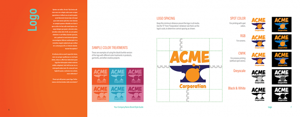
Brand Style Guide Your logo color and spacing guidelines in visual form with explanation.
In Creating a Brand Style Guide, Part 2: “Defining and Communicating Your Logo Uses,” you learned to think of your logo in terms of an asset that must be protected through strict usage and placement rules. You created different versions, color spaces, and formats to account(s) for its use in any situation and medium, including print, on the Web, in ePUB and fixed-layout ePUB, video, and other media. The “Logo” and “Logo & Tagline” sections of the template are where you detail those rules and demonstrate the correct usages of your logo. Pay close attention to page 7 in particular. As in the example, you should use that space to convey minimum allowed margins around your logo.
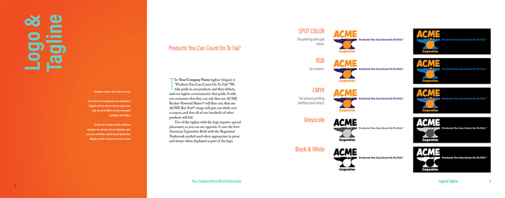
Branding and Logo Usage
Provide examples and rules governing the placement of the tagline, company name, or other important text paired with the visual logo.
Colors
Color may be only an important visual element of your brand or it may be the most vital brand element. Either way, you need to select and properly translate your brand colors for consistent, predictable reproduction across print, textiles, the Web, EPUB, video, and all other media. And then you need to communicate when, where, and how your agents must use your brand colors.
Part 3: “Establishing Consistent Brand Colors Across Media,” helped you do that by discussing the importance of color as a brand asset and identifier. Following that, you learned how to select brand colors for matching rendering in all media, using print colors as the foundation. With print-ready colors in hand, you then converted them to screen-ready RGB and ultimately hex color codes for Web- and mobile-applications. Your brand colors defined, you then learned to communicate the values and formulas of those colors, and their roles within the brand, via visual swatches but, more importantly, in unequivocal formulas easily duplicated by any brand agent.
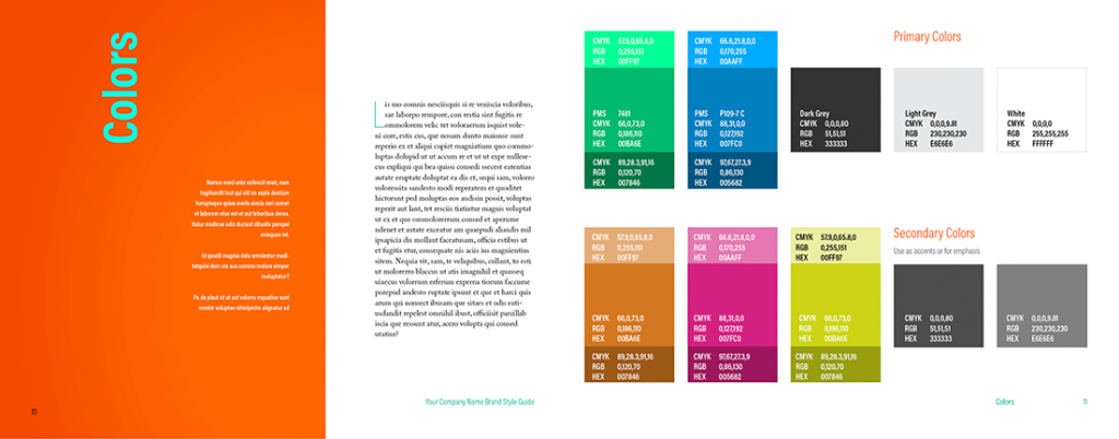
Color swatches and the formulas to recreate those colors in all relevant mediums make your brand colors unequivocal.
The template uses one of the swatch and formula combination samples created for “Establishing Consistent Brand Colors Across Media.” Each swatch, from the main colors in the center, larger blocks, to the lighter and darker tones that sandwich the main colors, is an easily recolored rectangle. The formulas are simple text frames instantly editable with InDesign’s Type tool. Adapting the “Colors” section of the template on pages 10 and 11 to your brand colors is almost effortless. Of course, you can also wipe out the sample swatches entirely and build them anew in your own style and format.
Typefaces & Fonts
Fonts are the tone of voice in which the mind’s ear hears your written message. As you carefully control the way your logo appears and the emotional impression your brand conveys via its colors, you need to just as meticulously control the perceived sound of your brand via the typefaces used to make your statements, tell your story, and sell your brand’s strengths.
In the fourth installment in the series, “Defining Your Brand Typography,” you learned the importance of typefaces to your brand, whether off-the-shelf typefaces or custom fonts commissioned to give your brand a truly unique voice no other brand has. You learned the value of choosing type families over individual typefaces for maximum flexibility before selecting special-use fonts to augment your main brand type families. Due to a lack of universal font support among digital document formats and devices, you also learned to select and define fallback fonts to control a graceful degradation of type appearance through devices with successively limited font selections.
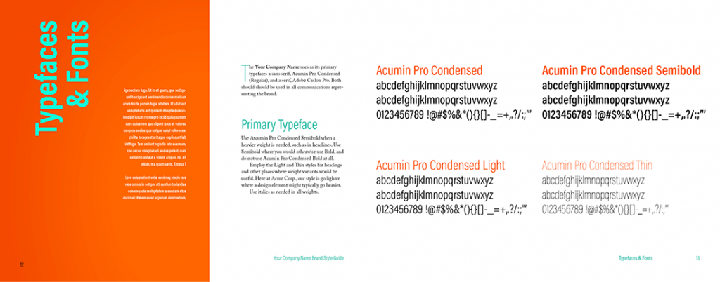
Present your brand typeface choices visually and with guidelines explaining when and where to use them.
On page 13 in the template, communicate to brand agents your organization’s primary typeface. Include not just the name of the typeface, but also the complete alphanumeric sets so that designers can easily evaluate and identify individual glyphs. Include such samples for each approved typeface in the type family. Do the same for your organization’s secondary or complimentary typefaces on pages 14 and 15. Use the space on pages 12 and 14 to explain the roles of each typeface within your brand identity. A few rules and guidelines will help designers know when and where to use the correct font.
Page 16 explains your brand’s fallback fonts while page 17 provides usable CSS font stacks for graceful degradation of fonts in HTML and ebooks.
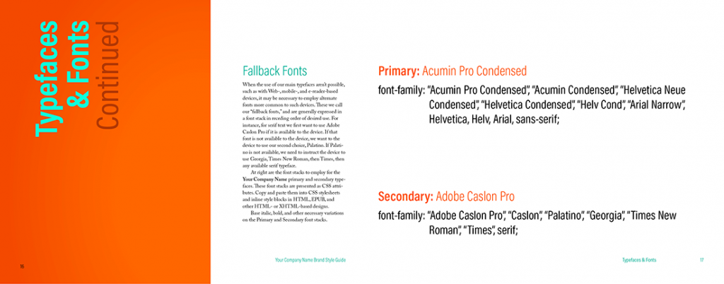
When digital devices might not display text using your brand typefaces employ fallback fonts in a font stack to influence font substitution.
Duplicate the page pairings if you need more space, such as to define and provide rules for special-use fonts. Use as many pages as necessary to display all fonts authorized for use in representing your brand.
Photography & Video
In Part 5: “Using Photography, Imagery, and Video in Your Brand,” you learned about the rising frequency of brand identities incorporating photographs and video. You learned methodologies for communicating their proper, consistent use within your brand style guide. Pages 18 and 19 of the template help you convey the visual language expected of your brand’s imagery. On the left page, describe the purpose and intent of imagery in your branded materials. Follow that with rules about the usage of images. Rules such as prohibitions against flipping or reflecting photographs, using images below a certain resolution or DPI value, or photos depicting particular types of subjects will help brand agents when commissioning, selecting, and using imagery on behalf of your brand.
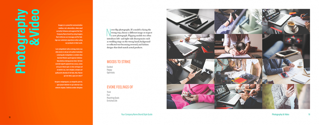
Convey the visual language of photography and video footage brand agents might use when representing your brand.
The “Moods to Strike” and “Evoke Feelings Of” lists on page 18 set the intent and scope of the visual language sought for association with your brand. Adjectives and descriptive terms help your agents—particularly creative agents—to choose photographs and footage that evokes the feeling, imparts the concepts, and speaks the language you want for your brand’s visual identity. Consider keeping these or similar lists and populating them with the most important 3-7 emotions, moods, and ideas connected to your brand.
On right of the spread, on page 19, replace the sample images of the template with actual images indicative of your brand. The best examples are those that are already in use representing your brand to the world.
Incorporating CSS Styles
Throughout the Creating a Brand Style Guide series we’ve talked about digital documents such as Web pages, EPUB ebooks, and fixed-layout ebooks on equal footing with printed media. While the latter is more familiar to many, and, more to the point, absolutely governable in terms of predictable representation of color, typographic fidelity, and precision sizing and spacing, striving to attain as much control as possible over every representation of your brand in all mediums is fundamental to the core concept of branding. You may not be able to predict with absolute certainty what typefaces will voice your message in an EPUB ebook on all devices, but you should definitely try to control it nonetheless.
Influencing display in unpredictable environments is the purpose behind fallback fonts and font stacks and, even more fundamentally, behind providing formulas for presenting your brand colors in CMYK, RGB, spot, and Hex. You chose your colors with a very careful method that ensures the greatest consistency regardless of medium, working hard to select representative hues that look as close as possible in print as they do on screen, on mobile devices and on clothing.
Web, ebook, and other digital document formats all use the RGB gamut, the largest selection of colors available to any mainstream device. They merely require that RGB colors be expressed in Hex color format. Finding that Hex color code was easy with the tools described in “Establishing Consistent Brand Colors Across Media.” It was just as facile as defining a font stack for typography in “Defining Your Brand Typography.” The question not answered by either article, which might yet be lingering in your mind, is how to get those values into your Web pages or EPUB ebooks. Doing that is an equally simple matter.
First, define your brand style selectors and attributes. Selectors are identifying bits of text—HTML tags, IDs, or classes—representing elements you wish to style. A body selector, for instance applies formatting to an entire document—a single Web page or an entire ebook—while an h2 selector formats only text defined as heading level 2. Either one starts with the selector name followed by a space and curly braces. Between the braces are the attributes, the actual formatting, to be applied.
The following code snippet, for example, defines the typeface, via a font stack, the fact that type should be rendered in the bold style of that font, a size for the text, and the color of level 2 headings. Note that the case of H2 is irrelevant; it is capitalized here for clarity, but may be written as lowercase or uppercase to the same effect. Additional rules may be included to set the look of H1, H3, and so on through heading level 6, as well as any number of other text, image, and other objects.
H2 {
font-family: “Acumin Pro Condensed”, “Acumin Condensed”, “Helvetica Neue Condensed”, “Helvetica Condensed”, “Helv Cond”, “Arial Narrow”, Helvetica, Helv, Arial, sans-serif;
font-weight: bold;
font-size: 140%;
color: #007FC0;
}
Once you’ve defined your CSS rules, you should make them part of your style guide—but not necessarily printed into the pages of the style guide. Rather, you might want to create a separate CSS stylesheet, with the .CSS file extension, that is made available to your brand agents alongside the printed or PDF brand style guide you generate from the template. A standalone CSS file containing all the brand’s Web- and EPUB-specific formatting removes even more ambiguity and allows consistent application of style rapidly.
Brand agents may easily copy and paste what they need from the CSS file; it can be opened by any text editor and hundreds of Web design tools such as Adobe Dreamweaver, CoffeeCup HTML Editor, and many more. It can also be incorporated in its entirety into HTML- and EPUB-based projects.
Incorporating your brand’s CSS file into one or every page of a Website means adding just a single line of code. The below, inserted somewhere between the opening and closingtags of the HTML page, would apply any styles in the CSS to matching identifiers throughout the entire page. Add the line to every page of a site to make them all look consistent. Future appearance modifications of every page of the site can be accomplished merely by editing the singular CSS file.
One CSS file may also be incorporated into another, which is incredibly helpful, and quite common, to add a relatively few brand style rules to a larger, more complicated project such as website templates or application user interfaces. A brand style guide that contains only font and color information, for instance, could easily be used to recolor and set the typefaces for a more complex CSS stylesheet that contains dozens of rules defining the entire geometry and structure of pages. Adding the following line of code to the top of the main structural CSS file adds the brand style guide CSS: @import ‚mybrandsyle.css‘;
Many applications even allow direct incorporation of standalone CSS files while generating HTML- and EPUB-based content. Adobe InDesign, for instance, let’s you add a CSS file during export to HTML and EPUB. Merely click the Add Style Sheet button on the Advanced pane of the HTML Export Options dialog or the EPUB Reflowable Layout Export Options dialog’s CSS pane, select the brand CSS file, and complete the project export. The effect will be the same as using the HTML tag or the @import CSS declaration.
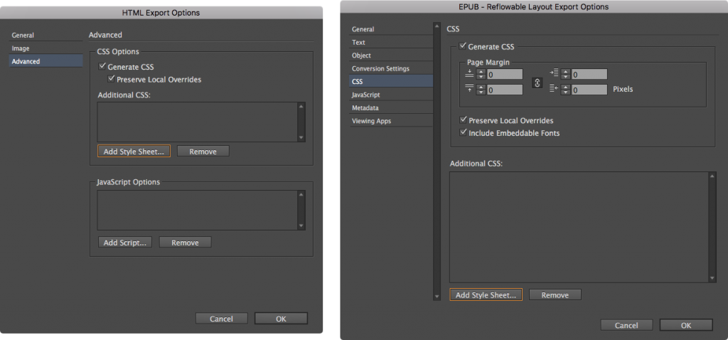
The Add Style Sheet button in HTML Export Options (left) and EPUB Reflowable Layout Export Options (right) allow you to incorporate an existing, standalone brand CSS file.
About the Author: Pariah Burke (Twitter: @iampariah) is a consultant, trainer, speaker, and the author of numerous books, video courses, and articles covering InDesign, InCopy, Photoshop, Illustrator, Acrobat, typography, asset management, epublishing, and the business of design. He is an Adobe Community Professional, an Evernote Certified Consultant, and an advisor to Adobe and other companies. He lives in Portland, Oregon.
Learn how five brand champions use digital asset management and font management to be outstanding. Get the eBook Brands That Stand Out from the Crowd.