How does typography affect our mood? How does it impact our first impressions of a new brand, or reassure us when we return to a company we’ve supported for years? Choosing the right font is one of the most important decisions in any design project. Yet most people don’t realize how much fonts can alter our perceptions and influence our buying habits.
Sarah Hyndman is out to change that.
Her events explore culture and the senses through typography, all the way from gigantic, multi-sensory, interactive exhibitions to smaller workshop open to the public. And Sarah’s book Why Fonts Matter discusses how type impacts our emotions and our experience of the world around us.
We recently spoke with Sarah Hyndman about how she got into typography, the bright future of her workshops, and how she fuels her endless curiosity.
Sarah Hyndman: I kind of fell into design and worked my way up. I'm very self-taught, I began as a sign maker and a screen printer. I never made a concerted effort to get into typography. As a designer, it's one of those things that you use all the time. And I think one of the main reasons I've specialized in it is because I didn't have any formal training. For a while, I felt like everybody who went to design college had this secret knowledge about typography which I didn’t possess. But of course, once you start looking into it more you realize there are no secrets. It's about putting in the hours and doing the legwork and also just being really curious. It was something that evolved quite organically for me.
Sarah: Yes, definitely, and there are two sides of it. First, I don't know what I'm meant to think. I've had to work it out for myself as I go along. It also means I’ve often taken the long way around when an answer already exists.
But I really enjoy the process. And I think that learning to be curious, and being open to going on a journey of discovery is a really valuable skill. Especially now as the world we’re living in is changing faster and faster all the time. The ability to change and investigate has kept me in really good stead. Granted, it means that I've made some mistakes along the way. And I’ve fallen flat on my face a few times. But that's part of the fun! You pick yourself up and you work out what you did wrong and what you can learn from it.
Sarah: While most of the ideas in the book appear quite spontaneous, they really aren't. Quite a few of those ideas have evolved since 2013 when I first began Type Tasting. People have commissioned me to create workshops and big events, and they’re all based on templates I’ve created myself over time. For everything I do, it always starts off with talking to lots and lots of people. And the more people you can talk to the more you get a sense of what people are interested in. You find out what they want to know, which tells you what to investigate. And talking to so many people was really quite humbling for me, because it showed me how to not make assumptions, and how little I knew about the topic.
And the more people I talked to, the more I realized that every single one of us is quite unique. That tends to be the starting point. And then there'll be a point at which there is a particular topic that is either really interesting to me, or so many people have mentioned it, that then it goes to the next stage.
For Why Fonts Matter, it began when I started exploring the psychology of typography. I was trying to find research and there really wasn't much so I started doing experiments. I dug into all the research out there, and when I wanted to find a book about it, again, it didn’t exist. Suddenly it made sense to collate everything I'd learned, turn it into a book, and then share it with everybody.
For my events, the process is more logical. One of the events I love doing is a wine and type tasting. The whole session is all about showing you how much you pre-judge your experiences, and how much you’re primed by things like labels and typography. I create these events where you're going to have a few surprises along the way, where I'm going to show you that even though you think, “No, I'm not affected by typefaces or primed in any way,” you'll find out that you are. These events are much better in person, because I can see everyone’s reaction and I can immediately ask questions, and I can feed the responses back into the next thing that I'm working on.
Sarah: Typography is all around us. It’s easy to forget there's something about the way the brain reads letters, that there’s this visual layer in between you and the ideas you’re reading about. It’s kind of like the air we breathe: everywhere you look, there’s type. If you give me a topic, I can turn it into a subject, because pretty much everything has type wrapped around it. If we're walking down the street, I can create an event out of the signs we pass on our way. The signs we see create a kind of typographic DNA for that area. Not too long ago someone challenged me to do something with chocolate because we were eating chocolate at the time, so I started looking at chocolate wrappers. Wherever there’s type, there’s a bit of inspiration.
And I'm even more interested in type that tells stories. For me, there’s a limit to how interesting neutral typefaces can be. That’s not really my world, looking into readability and legibility. There are plenty of designers who specialize in that, while I see myself as the person that encourages other people to fall in love with typography. And that's best done through really exciting typefaces. And once you fall in love with typography, once you're really excited about it, then your eyes get more tuned in and you start to see all the nuances and subtleties.
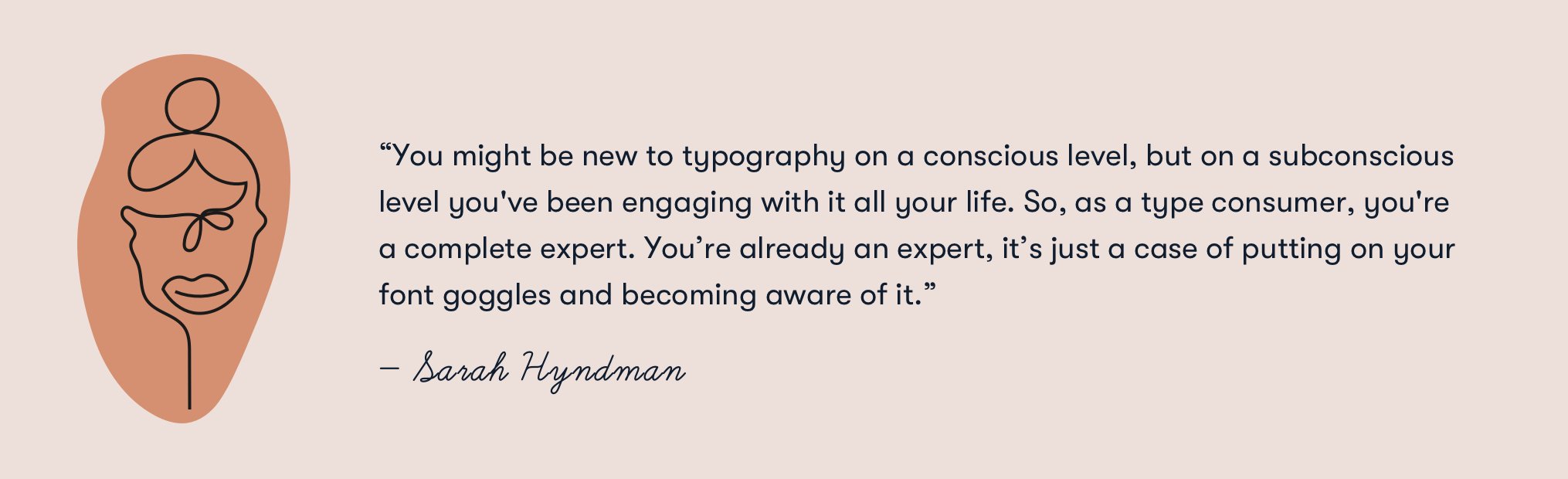
Sarah: Thank you. I would also question you saying that you're new to typography. You might be new to it on a conscious level, but on a subconscious level you've been engaging with it all your life. So, as a type consumer, you're a complete expert. As you walk around a supermarket you filter what you do and don’t want to buy through typography. You’re already an expert, it’s just a case of putting on your font goggles and becoming aware of it.
Sarah: This goes back to me being self-taught and trying to find how I could learn about typography. If you look at children's books, you’ll see type kind of whizzing around the page. It's incredibly expressive. But at some point, once you become a designer, or once you start working in communications, type suddenly becomes incredibly serious. And it becomes this topic that you feel like you have to be an expert to talk about. I went from being joyful about type when I was much younger, to becoming a professional and starting to feel really awkward, like I didn't know enough.
When I set up Type Tasting, I was trying to find a gap where people weren’t already teaching something, or talking about something, or researching something. And that’s when I came back to this idea that typography is meant to be joyful. But when you try to learn about it, it becomes really serious. Especially now, as design tools are becoming increasingly democratized and so many designers aren’t going through traditional routes to earn a design education, there has to be a better way to teach everybody about type. So that was where I wanted to start from, because I don’t think everyone who wants to learn about typography should plunge into academia.
The idea of Type Tasting is, it's like a wine tasting for typography. It's short, social, immersive, and multi-sensory, because type relates to all of your experiences. It doesn't just relate to what you look at. Typography relates to what you listen to, what you smell, what you taste, all the senses. That’s what’s exciting for me, is creating events that immerse you into the whole world of typography, but in ways that feel completely instinctive and experiential. And then once you've done that, and you’re invested in this subject, then you can work your way up to academic levels if you want to go further in that direction.
Sarah: So, in terms of type reflecting cultural change, as I was learning about the different styles and categories of typefaces, that meant revisiting larger societal shifts throughout history. For example, if you show me a groovy, psychedelic typeface, I know that comes from the ‘60s and ‘70s and I can tell you a lot about it. And if you show me an old English typeface, again, I can tell you what era that comes from. So, on a high level I was aware that each typeface tells a story about its origins, and those stories change over time. And I got really interested in how these stories evolve, and how typefaces narrate social attitudes and document cultural changes.
If you think about the last 10 - 20 years, we've had a lot of really neutral, geometric, sans serif typefaces. This is what type designers are forever being briefed on as “millennial style” app typefaces. And especially over the last 10 years with typefaces like Helvetica Light, because Apple was teaching us how to have good taste. So, it’s been a really neutral and minimal typographic landscape for quite a long time.
But in the last three to six years, that's completely changed. Now we’re heading into a time when typography is incredibly exciting. For example, we've had really sharp, kind of triangular serifs in a lot of publications ranging from Medium to The Guardian’s masthead. These are publications telling you what you need to know, not necessarily what you want to know.
Left to right: Medium, The Guardian
And on the other side of it, we've had all of these really curvy typefaces. Look at Chobani and how they redesigned their logo based on the Windsor typeface, which is really curvy and looks like it's been painted by a paintbrush. And that’s just one example of some of the many curvy typefaces we’ve seen over the last few years. Even before 2020, these typefaces evoked comfortable luxury in many different forms. Then, during the pandemic, these same typefaces also brought up feelings of nostalgia. People may look at Windsor and think it’s from the 1970s, but it’s really an Art Nouveau typeface from the early 1900s. So, that typeface was referencing nostalgia right when everyone was trying to feel more grounded and looking for comfort during lockdowns. For me, Windsor was like the banana bread typeface of 2020.
Left to right: old Chobani logo, new Chobani logo
And now, if you look at a lot of corporate rebrands, they still look quite neutral, but they’re starting to have little twists in the typefaces, where you see ink traps, which are those wavy shapes hidden within the letters. Fonts in these rebrands are starting to look a little wavier, a little curvier, and they’re starting to feel more human.
So, we're moving away from, “Hey, I'm cool!” to, “Hey, I speak like a human, because I'm speaking to you as a human.” You can kind of see that's collectively how we're feeling in society. So, it makes sense that typefaces and the typographic landscape are mirroring these changes. I talk a lot more about the connection between typography and our senses on my Patreon.
Von links nach rechts: old Mailchimp logo, new Mailchimp logo
Sarah: I completely agree about the complexity. It's a balancing act between the industry’s expectations and what their clients care about. And how do these two factors overlap with the company’s values? And how do you take all that into account and transform your brand in a way that feels fresh, authentic, and honest? And you also have to keep your brand up-to-date, so it doesn’t look like you’re stuck in the past.
With so much to explore in the space where branding and typography overlap, we decided to split our interview with Sarah Hyndman into two parts. Part II goes into greater detail on Sarah’s events and how she brings people together through the power of typography.