Creating a Brand Style Guide Series is written by Pariah Burke, consultant and trainer for creative, publishing, and editorial professionals.
In the previous installment, Part 2: “Defining and Communicating Your Logo Uses,” you learned to think of your logo in terms of an asset that must be protected through strict usage and placement rules. You created different versions, color spaces, and formats to account for its use in any situation and medium, including print, on the Web, in ePUB and fixed-layout ePUB, video, and other media. You learned how to manage and organize your different logo editions for easy access by any teammate, partner, or client, as well as how to communicate logo usage guidelines and proper treatment for each rendition of the logo right within the logo file itself. You learned to document through text and visuals rules required sizes, placements, and spacing around the logo, alignment of the logo relevant to specific surrounding elements, and other common brand style guide requirements for consistent logo application.
Depending on your business, what it does, what it stands for, color may be an important visual element of your brand or the most vital.
Coca-Cola owns several truly iconic trademarks such as the flowy script of its logo, the shape of the classic Coke bottles. As valuable as those pieces of intellectual property are, none is more so than the color Coca-Cola Red. It’s a registered trademark color vigorously protected in every country in the world. Few people on Earth don’t instantly connect and equate that unique and almost ubiquitous shade of crimson with Coca-Cola, even when the color is far removed from a can, bottle, or white swoosh.
Where would Barbie be without her signature pink? Mary Kay and T-Mobile are also identified by their own unique, trademarked hues of pink. What could brown do for you if it wasn’t so intrinsic to the UPS brand? Millions of people start their days with the signature green aprons, cups, and wrappers of Starbucks. More aprons, this time in orange, even more readily identify the Home Depot brand. The list of brand-crucial colors stretches on, across all industries.
These colors are not randomly chosen. More to the point of this article, the colors are very important to each brand and never applied haphazardly or roughly translated between media.
Different mediums produce color using different materials, methods, and formulae. The web, ebooks, and video mix light to produce color. Light, as you may recall from junior high school, is the visible segment of the radiation spectrum. All the 16.8 million colors that the human eye can perceive are all made by visible light, all possible on computer and television screens, and all expressed as formulas of red, blue, and green values. Colors printed on paper, on the other hand, are done so by printer’s ink, either pre-mixed specialty colors or process ink that breaks down formulas based on the mix of the four base colors of cyan, magenta, yellow, and black. This is called 4-color process printing. With pigments created by such things as metal flakes and ground stones, the number of colors possible in 4-color process is significantly less than that available on screens, with approximately 65 thousand shades compared to nearly 17 million possible with RGB-based light. Your brand identity colors must work in both color systems—and more.
RGB and 4-color process, more commonly called CMYK, are the two systems most brands will use, and thus the most important to target when selecting colors, but you’ll want to prepare for other color systems, too. Because 4-color process offers such a small range (gamut) of colors, a system of premixed inks, called spot colors, exist to open your printed color options to thousands of more hues, including specialty colors such as pastels, neons, and metallics. If your brand will ever appear on clothing or other textiles, you may need to have its colors faithfully reproduced in color dye or screen printing ink as well.
If you haven’t yet selected and finalized your brand colors, the best way to do that for the most consistent reproduction across all mediums is start the right way, in the right system. We’ll do that just below.
If you already have your brand colors chosen, you’ll need to learn to translate those colors into the closest reproduction in every major color system and medium. That follows in the middle section of this article.
Whether you start with or need to select brand colors, you’ll need to clearly and effectively communicate those colors to agents who will work with your brand. The third and final section below will focus on just that.
Starting from a blank slate or with colors that aren’t completely finalized, you have the opportunity to choose brand colors at the convergence of all media color systems. That means near identical, and possibly truly identical, color reproduction across media.
The RGB, light-based, color model is used on all multi-color screens. That means computers, mobile devices, televisions, and even projection media such as film can display the entire range of hues and shades the human eye can detect. RGB encompasses and exceeds all the other color system with which you should concern yourself; every color possible in CMYK, fabric dye, paint, and more is included within the gamut of RGB. In short, if your eye can perceive it—if it is a visible color—then it can be displayed in RGB. That’s the good news, and reason number one why you should never choose your brand colors on a computer screen.
The second reason is that screened devices display color differently. A practical demonstration of that is easy: just look at the same photograph or visit the same website on computers, tablets, phones, and televisions from different manufacturers. Most often you’ll even find noticeable color differences across devices from the same manufacturer. A perfect match from screen-to-screen is impossible. In fact, the odds are quite slim that the screen you’re using right now to read this has perfectly accurate RGB color representation; you and I and the next reader will likely see the colors in the below figures slightly differently because of our devices.
RGB is the largest color gamut. Never start with the largest; always start with the smallest. If you select colors from among the smallest set, a set encompassed by other sets, your colors will be the same in all sets.
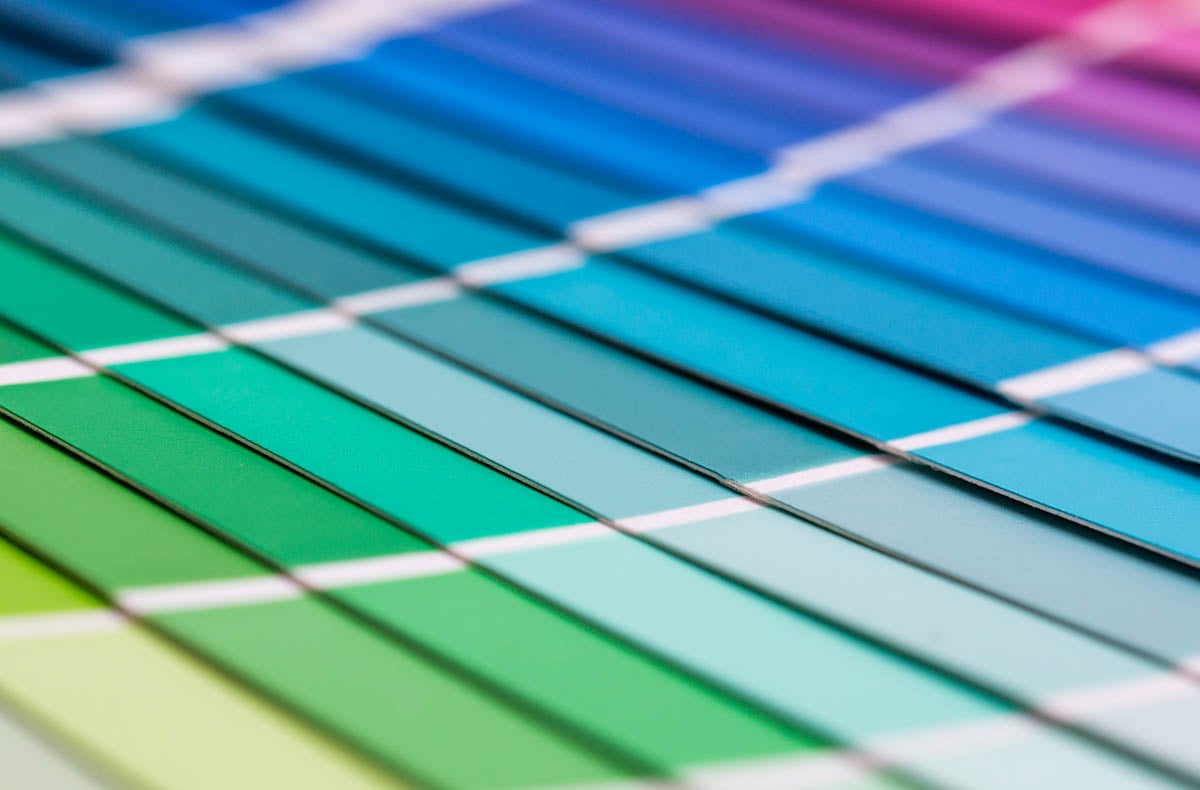
Choose your colors from the limited gamut of CMYK or print spot colors to ensure that your color can be printed and displayed on screen. Do that by choosing colors from the North American standard printing color system, the PANTONE MATCHING SYSTEM (PMS). Specifically, use a PANTONE CMYK Guide swatch book such as the one shown below in Figure 1. Ink, like fabric dye, fades over time; paper, like fabric, discolors over time. PANTONE swatch books are specially printed to preserve color fidelity for a period of one-year from issue. Printers also have to guarantee that they can reproduce the colors in PMS swatches. Therefore, if you use a new or well-cared-for recent swatch book to choose your colors, you can be assured of getting that color every time you pay for a printed project. Even better, PMS is such a major matching system that its recognized worldwide, with conversion charts to European, Asian, and other printing standards, as well as to non-process ink color matching systems such as fabric dye, dye sublimation, and paint color systems.
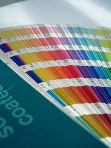
Figure 1 – Swatch books are the reliable way to choose colors for consistent color rendering in print and other media.
Where can you get a PMS swatch book? You can purchase your own, but if aren’t a graphic designer or plan on picking new colors every few weeks, I wouldn’t advise you do that. Instead, ask your graphic designer or the manager of a local quality print shop to spend a few minutes with her PANTONE CMYK Guide. These professionals can also help you with some of the other considerations of choosing colors, such as the emotional values your customers might attach to specific colors, avoiding colors too close to your competitors’, and steering you clear of played out trends.
If your ideal brand colors can’t be found among the CMYK swatches reproducible by mixing one or more of process cyan, magenta, yellow, and black, you might want to select a spot color. PMS far exceeds CMYK process inks with a range of thousands more hues in pre-mixed inks. The trademark colors of Coca-Cola, Starbucks, UPS, and Barbie will not be found in the PANTONE CMYK Guide swatch book. You’ll find the best colors to use for your brand in the PANTONE Formula Guide. Printers have to order these inks pre-mixed from their suppliers, and their use on printing presses requires additional setup time. This makes them more expensive to use than mixing process inks, but the rewards are usually worth the extra expense. Not only will you have a much wider range of colors to choose from than those available using a process ink mix, but also the color fidelity is even more strictly governed; you will get precisely the same color, using the same substrate (paper or other material), every time, on every print job, from all the printers with whom you work. Spot colors, too, can be easily translated into other systems.
PANTONE even makes metallic, neon, and pastel inks, which you’ll find perusable in matching PANTONE Premium Metallics and PANTONE Pastels & Neons swatch books. For most businesses, however, you’ll want to avoid choosing one of these are your primary or even secondary colors because metallic, neons, and pastels are not available in all media; you don’t want to choose colors that only work in a single media.
Once you’ve selected your primary, secondary, and sometimes tertiary or accent colors, you’ll want to make note of their PMS numbers, the unique identifier code that enables your printers and other providers to look up and match the color. PMS 7481 U, for example, is the identifier of a particular shade of green. The U stands for uncoated, which refers to the paper. PANTONE swatch books come in two flavors—coated and uncoated—showing what colors will look like on glossy and matte stock, respectively. Whether paper is coated or not can significantly alter the way a color looks, so you’ll want to compare the same PMS number in both the Coated and Uncoated swatch books to make sure it’s the color you want. You might even choose different coated and uncoated inks, though its uncommon to do so.
Armed with your brand colors chosen from swatch book that provides standardized, predictable rendering in print, it’s time to translate those colors into your other media. That’s actually quite an easy process, assuming you started with CMYK process or PANTONE spot colors.
Process or CMYK color swatch books provide right under the color itself the formula for mixing cyan, magenta, yellow, and/or black to produce the color. That formula is expressed as percentages of the four process inks—for example, with the blue PANTONE P109-7 C, which you can see in Figure 2, the formula is 88% cyan, 31% magenta, and 0% for both yellow and black. It is correctly written as C: 88 M: 31 Y: 0 K: 0, 88-31-0-0, or 88,31,0,0. Non-process color swatches may have formulas beneath them, too, but they’re typically mixes of other PANTONE spot inks, such as PANTONE Green 40.60, PANTONE Yellow 9.40, and PANTONE Trans. White 50.00 for the PMS 7481 U color (see Figure 3). Don’t bother recording such spot color formulas. All you need for non-process PANTONE colors is the code itself like the aforementioned PMS 7481 U green.
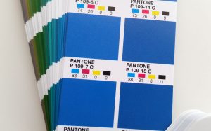
Figure 2 – Swatches in the PANTONE CMYK Guide swatch book display the CMYK process color formula beneath the swatch.
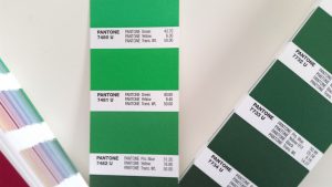
Figure 3 – Spot color inks, such as 7481 U in the PANTONE Solid Uncoated Formula Guide swatch book are special inks that don’t include CMYK process color formulas.
A PANTONE color code and/or a CMYK formula is all you’ll need to get your brand colors reproduced on paper or other printed materials. They work directly for offset printing, the most common type of printing, as well as flexography (aka “flexo”), gravure, and digital printing. It’s also all the color information you’ll need to furnish to other print service providers, such as those doing your screen printing or fabric dying because the PANTONE Matching System is such a comprehensive printing industry standard, including conversion guides to these other color systems. Those providers will have such conversion guides, though you can purchase your own, too.
With physical color preproduction therefore handled, it’s time to convert your PANTONE or process colors to digital colors. That starts with converting to RGB. Converting CMYK to RGB is quite simple; converting PANTONE spot colors takes a little more effort.
Nearly any design, drawing, page layout, or photo-editing application will instantly convert CMYK to RGB for you. In Figure 4, for example, you can see that I’ve entered CMYK values into the Colors panels of Adobe InDesign, Illustrator, and Photoshop, and then merely changed the display mode of those color panels to RGB. The applications do the conversion as soon as the mode is changed.
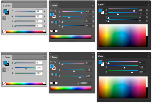 Figure 4 – CMYK and RGB values into the Colors panels of Adobe InDesign, Illustrator, and Photoshop.
Entering a CMYK formula into the Color panels of common creative applications and then switching those panels into RGB mode does an instant conversion between the two color systems. Left to right, the Color panels are from InDesign, Illustrator, and Photoshop, with CMYK modes above and RGB conversions of the same colors below.
Here’s how you can do the same conversion:
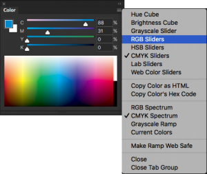 Figure 5 – Select RGB from the Color panel menu to switch from CMYK to RGB mode, simultaneously effecting the color conversion.
Select RGB from the Color panel menu to switch from CMYK to RGB mode, simultaneously effecting the color conversion.
Write down your color’s RGB formula and repeat the process for each of your brand’s other colors. Now you should have the CMYK and RGB values.
If you have design applications other than Photoshop, Illustrator, or InDesign, there is typically a similar process to convert colors within it. If not, or if you don’t have any such creative application, you can use the online Adobe Color CC tool (formerly Kuler). Adobe Color CC is a free tool you can use with or without an Adobe account (see Figure 6).
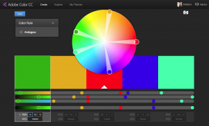 Adobe Color CC is a free online tool that, among other things, makes conversion between CMYK, RGB, and hex color values simple.
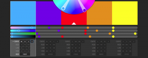 Figure 7 – After clicking the spinner arrow beside the RGB line additional color model fields are revealed.
RGB colors are properly written as comma-separated values such as 31,176,255. Optionally you can prefix the formula with RGB, as in RGB 31,176,255.
Most such applications can also convert non-process PANTONE colors to RGB, as well, but that often involves manually selecting the PANTONE color from a New Swatch dialog and then jumping through a few more hoops. The easier method is to use a free online tool PANTONE itself provides.
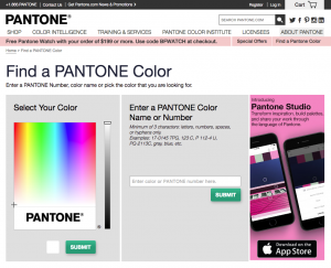 Figure 8 – The online PANTONE Color Finder tool helps you look up and convert PANTONE colors, codes, and formulas.
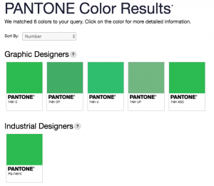 Figure 9 – If the value you enter in the search field matches multiple PANTONE colors you’ll be presented with a choice. Click the one that matches your intent.
The next screen presents the selected swatch along with its RGB, CMYK, and hex color values (Figure 10).
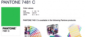 Figure 10 – The PANTONE Color Finder search returns the matching PMS swatch as well as its CMYK and RGB formulas and hex code.
Most digital uses of your brand will rely on your colors expressed as RGB formulas. Some projects, however, will require your colors in hex values. This is especially true for CSS- and HTML-based materials such as Web pages, tablet publications, mobile apps, EPUB ebooks, and fixed-layout ebooks. All of these have the capacity to use RGB formulas, but, depending on other design decisions entailed in their creation, hex color codes might be needed. For those situations you will want to have hex colors included in your brand style guide already to reduce the risk of incorrect colors creeping in.
Adobe Color CC does that conversion, too. Note the last row beneath each color swatch. Simply entire either the CMYK or RGB formula into the appropriate fields and, upon leaving the last field in the line, Adobe Color CC will provide the hex color, which is often a mixture of numbers and letters, though, with some colors, only one or the other.
Now that you have your brand colors in the main color systems, it’s time to clearly communicate those to agents who will employ them.
The ideal way to communicate your brand colors within your style guide is to present the color visually, tied directly with all its formulas and codes, and then to communicate appropriate uses of each color.
The large color swatches provide a visual representation. Beneath, beside, or inside the color swatch should be all the codes and formulas needed to reproduce the color, as close as possible, in all major media. Additionally, each color should be named for its role in the brand, if possible. Naming the color, even if the color isn’t a trademark like Coca-Cola Red or Barbie Pink, attaches gravitas to the color’s role in the brand and helps internal and partner agents understand that role and the importance of correctly and accurately using the color when representing the brand.
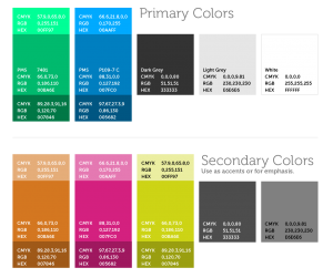 Figure 11 – Colors displayed within a brand style guide.
The best brand style guide also includes directions on where and when to use each color, for which brand elements, and which design and document components. For instance, you might want to include directives such as which elements of the logo utilize each color; the color to use for hyperlinks or other elements in Web, EPUB, and other digital documents; which colors to use for specific heading levels in editorial, promotional, and internal documents, and; how lighter and darker shades of brand colors may be properly used to accent and support their brand primaries. Figure 12 shows colors and basic instructions. The more rules and guidelines you can put down in black and white about using the red, brown, or pink, the more easily agents who work with your brand will be able to faithfully represent that brand in its signature colors.
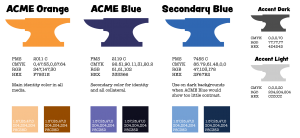 Figure 12: Another strategy for communicating brand colors within a style guide is to include information on how and where to the colors.
Today, color may be intrinsic to your brand, or it may not. Like Coca-Cola, UPS, and Barbie, consumers may come to equate a particular shade of color with your brand, making that color as unique and identifiable as your logo. Your colors may become valuable intellectual property on par with any other IP asset you own. None of that will be possible unless you pick appropriate colors that translate faithfully across media, and whose correct, brand-reinforcing usage you’ve specifically defined and communicated.
In Creating a Branding Guide Part 4: “Defining Your Brand Typography,” you’ll choose typefaces to represent your brands, going beyond the only two typefaces, one serif and one sans-serif, into choosing versatile families of typefaces that include multiple weights and styles to account for different uses, defining rules for the correct typeface to use in each case, as well as the need to have “fall back fonts” for media in which your main typefaces are unusable. Not all fonts are available on all devices. You will learn to define rules within the brand style guide for the usage of all brand typefaces and fonts across all media in which your brand has, or might establish, a presence.
Pariah Burke (Twitter: @iampariah) is a consultant, trainer, speaker, and the author of numerous books, video courses, and articles covering InDesign, InCopy, Photoshop, Illustrator, Acrobat, typography, asset management, epublishing, and the business of design. He is an Adobe Community Professional, an Evernote Certified Consultant, and an advisor to Adobe and other companies. He lives in Portland, Oregon.