PART FOUR OF CREATING A BRAND STYLE GUIDE
The Creating a Brand Style Guide Series is written by Pariah Burke, consultant and trainer for creative, publishing, and editorial professionals.
Design is how you look. Type is how you sound. The tone of voice used by your type is your brand’s fonts. They need to be carefully selected, faithfully synchronized, and rigorously protected as the licensed intellectual property they are.
In the previous installment, Part 3: “Establishing Consistent Brand Colors Across Media,” we discussed the importance of color as a brand asset and identifier. You learned how to start off selecting brand colors for matching rendering in all media, using print colors as the foundation. With print-ready colors in hand, you then converted them to screen-ready RGB and ultimately hex color codes for Web- and mobile-applications. Your brand colors defined, you then learned to communicate the values and formulas of those colors, and their roles within the brand, via your organization’s brand style guide.
Fonts Give Your Brand a Tone of Voice
I’ve been quoted as having said: “People respond more to how you look and sound than to what you actually say. Design is how you look; type is how you sound.” The last statement is an axiom to keep in mind as you consider the typefaces—fonts—that represent your brand. Another aphorism I’m found of is “a typeface is the tone of voice in which the mind’s ear hears your written message.” Printed text is how your brand is represented when you aren’t there to speak for it. The fonts you use to set that text provide the tone and emotional context for your printed words. As the brand manager, you should be as meticulous in choosing and controlling the fonts used to represent your brand as the colors and imagery.
Commission a Custom Font
To truly make your brand unique you can commission a custom font. A bespoke typeface would be yours and yours alone, giving your brand a unique voice. If the idea sounds far-fetched, it isn’t; it’s quite common. Adobe, British Airways, Buccellati, Domino’s, Dwell Magazine, General Electric, HarperCollins, News Corp., Sony, Southwest Airlines, and Zazzle are just a few companies who wanted signature fonts that were genuinely signature—unique and designed to the brand. Even humble Times New Roman, the ubiquitous typeface pre-installed on every computer since 1992, was a custom font commissioned in 1931 to give its purchaser, the London newspaper, The Times, an exclusive and highly readable typeface.
If its within your budget, a bespoke typeface is not only a unique, proprietary voice for your text, it also imparts a measure of refinement, elevating brands to a higher tier. Most reputable type foundries offer custom font creation, starting from scratch or honing and reworking an existing typeface or type family.
Choose Type Families, Not Typefaces
You may already be aware of the convention of choosing one serif and one sans serif typeface for branding. That’s sage advice. What is more sagacious, however, is to choose broad families of serif and sans serif typefaces that go beyond the standard and quite limited bold, italic, bold-italic, and roman, or plain, versions. Look for a wider range of weights than simply regular and bold. Thin, light, book, medium, semibold, bold, heavy, extra bold, and black weights give you a range of type color options beyond the two available with regular and bold. Try to also standardize on families containing different widths such as narrow, condensed, semi-condensed, extended, ultra-extended, and wide.
Choosing typography is a very important component of your brand’s style guide. Learn how to create your own guide and take your brand strategy to the next level:

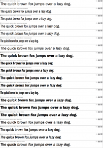
In Figure 1 you can see in my font manager just some of the weights, widths, and styles available in the Futura Std family from Adobe. That family comprises twenty fonts in all. You’ll find similar, and often larger, selections styles in other sans serif families like Univers, Helvetica Neue, Frutiger, Dax, Avenir, various editions of Akzidenz Grotesk from different foundries, and hundreds of other type families. Serif families, too, often include a variety of weights, widths, and styles. Mrs. Eaves, Minion Pro, Adobe Jenson Pro, the slab serif Chaparral Pro, and many foundries’ issues of Palatino are robust offerings that include light, regular, semibold, bold, and often other weights and versions.
For designers, the many weights and widths within a typeface provide creative options without having to resort to distortions such as adjusting horizontal or vertical scale. Hierarchies, for instance, can be easily communicated even in a minimum of inks. All those weights and widths are drawn by the type designer to agree with the stroke weight, counter size, and all the other characteristics of each other font in the family. They go together and look cleaner than any manually adjusted, faux width or stroked-faux-weighting ever could.
Brand owners should seek out type families with an array of weights, widths, and styles in order to provide creative options to graphic, web, and publication designers who create documents and designs incorporating or representing the brand. The availability of many faces within the family opens creativity while easily closing off unauthorized, undesired tinkering with type that can reduce not only legibility and readability but brand association as well.
Pick serif and sans serif type families that work well together, too. Fonts can clash—easily. You want typefaces that not only work at a variety of sizes and in different roles, but also when paired together. In print, for instance, headings and titles are often set in a sans serif typeface while readability is often best served using a serif typeface for longer passages of text such as body or paragraph-length copy. Both may be dazzling typefaces, but if they must also look handsome together, complementing one another, in all the possible combinations of their weights, widths, and styles.
Special Use Fonts
Although you should focus your brand type choices on a single serif type family paired with a single sans serif type family, its not uncommon to require a little something extra in the text of documents created by your organization. On your company blog or within whitepapers, for example, you may find the need to present lines of code or other special text. For such uses you might choose a third typeface or type family such as a monospaced family like Courier New or Consolas. Other specialized needs come up, as well.
Perhaps the serif family you’ve chosen lacks an essential or even just preferred symbol. If your company needs to produce documents with prices in Euros € or Pounds Sterling £ and the type family you’ve chosen doesn’t include those currency symbols you shouldn’t have to abandon that type family. Ideally, you’d want to hire a type designer to add those symbols into your chosen fonts, but if the budget or font licensing prevents that, a valid and common solution is to find and standardize on additional fonts that do include the missing symbols. Indeed, when the Euro symbol was first designed and ratified by the European Union, no font included it, prompting industrious foundries to create single-glyph fonts whose entire content was the Euro symbol.
You might find that you also want to incorporate specific dingbats, fleurons, or other symbols from symbol fonts such as Zapf Dingbats, Webdings, the for-charity Font Aid IV Ampersands font, or any of hundreds of other special fonts. For your website and mobile apps you might indicate the use of distinct symbols from Font Awesome, the open source font filled with standards-worthy user interface icons. Bulleted text in your marketing material might look best using with bullet symbols from Wingdings 2 or PizzaDude Bullets.
Establish identity and a consistent voice by using only a single serif type family and a single sans serif type family for the majority of text in all your branded communications, but don’t be afraid to incorporate additional, special use fonts to fill in gaps, replace ho hum symbols, or enliven your text where appropriate.
Fonts for Web, eBooks, and More
At the risk of sounding pedantic, it’s important I point out that fonts are pieces of software; they’re more like applications or apps than images or documents. The distinction is important for several reasons, two of the big ones being that fonts are licensed for use by number of computers or users, and to function as intended, fonts need operating systems or other foundation software. Neither is necessarily the case when fonts are used in digital documents.
When sending a document for output to physical media by a print service provider, fonts are generally included with the document, either as their separate OTF or TTF files sent along with the document or wrapped inside the document itself, as is common with a PDF. Web pages, EPUB ebooks, and fixed-layout ebooks, however, cannot embed fonts as PDFs can. Web pages can use separate font files—in their original OTF or TTF formats or as Web-centric WOFF, EOT, SVG, or Javascript-based font files—but such use is often prohibited by the licensing on your fonts, something we’ll discuss below. If your font licenses allow, you can use your same brand typefaces in all digital media, though viewers of your EPUB files may not see your fonts because of the limitations of some ebook reader devices.
Adding fonts to CSS, which is the styling language in HTML Web pages, EPUB ebooks, and certain other digital publication formations, is a matter of including just a few lines of code. First, you must give the font a name for referencing later in the CSS as well as tell the HTML or EPUB renderer where to find the font file on your web server. The following code does both.
@font-face {
font-family: 'MyFont;
src: url('/fonts/MyFont.otf');
}
Placed inside the site or ebook CSS file near the top, the font-family attribute gives the font a name to be called later (see the next paragraph). The src attribute provides the URL, relative to the CSS file’s location, where the font file can be found. Note that each individual font has to be identified with an @font-face block including font-family and src; thus the roman or regular version of the font needs one @font-face block, the italic style needs its own @font-face block, the bold and bold-italic fonts each need their own @font-face blocks, and any additional weights, widths, or styles each need a block.
Once the fonts are identified and located, they need to be applied to elements and objects via CSS selectors. The permutations for such are endless, but styling the entire web page with the fictional “MyFont” would be done with the following lines of code inside the same CSS file.
body {
font-family: MyFont;
}
If, for any reason, you can’t use the same fonts on the Web, in PDF or fixed-layout ebook, or in EPUB, you’ll need to choose what we call “fallback fonts.” Fallback fonts your choices for acceptable alternatives to your brand typefaces, and you must select them from a very small pool of fonts all but guaranteed to be installed on all viewers’ devices. Our old friend Times New Roman is one, as is Courier New, and Arial. Every modern device carries those three or pre-mapped alternatives to them such as Times (without the “New Roman”), Courier (not “New”), and Helvetica, the source from which Arial was derived. A second, broader tier of usually available fonts is also available to you for fallback font choices. For serif typefaces this second tier adds only Georgia. Sans serif choices are more plentiful with the addition of Tahoma, Trebuchet MS, and Verdana. You can be fairly certain these fonts are available on Web-connected devices. They’re so common, in fact, that those few devices that omit them include built-in fallback rules to substitute near-equivalents to each.
You can create fallback font rules inside the CSS yourself. They look like the below example, with the fictional “MyFont” being the first choice, then, if that font isn’t available, asking the system to use Georgia. If Georgia isn’t available, the code indicates the device should use Times New Roman, then Times, and finally, if none of the four is available, whatever serif typeface is on the system.
body {
font-family: MyFont, Georgia, “Times New Roman”, Times, serif;
}
That if-not-this, then-that sequencing of fonts to use is called a “font stack.” It’s important because it gives you control over the staged loss of control over the appearance of your text. As each successive font is absent from the viewer’s computer, tablet, phone, or ereader, the font stack allows you to direct the degradation of appearance. Because control—whatever control you can exercise—is the entire point of branding, you should include such font stacks in your brand style guide. For each of your brand’s typefaces, the serif, the sans serif, and any and all special fonts whose glyphs might be used in web, EPUB, and similar CSS-controlled digital documents, create a font stack your brand agents can use. If you’re distributing fonts online or embedding them in the digital document, include the @font-face code block. Start each font stack with that font or, if you are not including your actual brand fonts, with your first choice substitute. Then specify each successive acceptable alternative all the way through the base font category, either “serif,” “sans-serif,” or “monospace.”
Control Your Font Licenses
Central to maintaining your brand typography is making sure all your team members have access to your brand fonts. You need to do that legally. Fonts are software, intellectual property, and your use of them is typically governed by a license that grants specific rights and restricts others.
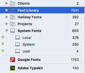
Font usage is typically licensed by number of seats or users. If you are a one-person company, you’ll purchase a single-seat or single-user license while a 30-person team will need a different, larger site or multi-user license to enable the use of the font throughout the team. As the Hidden Risks of Font Misuse Report clearly reveals, there are consequences for using fonts without adequate licensing, whether you’re a political candidate, a small business, or a television network. Once proper licensing has been purchased, its crucial to establish and maintain licensing compliance systems to prevent font assets, tiny pieces of software that are easily and ignorantly shared and re-shared, from being used out-of-license. Font management solutions such as Extensis Universal Type Server are built for that purpose (see Figure 2).

Managing fonts and licensing across the organization and all groups in Universal Type Server.
Universal Type Server uses a browser-based interface to administer font activation, distribution, and licensing for organizations of two to two million users. All the company fonts are added to Universal Type Server along with the number of users or seats licenses purchased. Fonts can be organized into various sets and groups by whatever organization scheme makes sense to you. At least one set should be “Brand Typefaces” and include the entirety of your brand’s type families—main, signature typefaces as well as special fonts and any fallback fonts for specific media. That Brand Typefaces set can then be easily activated by all team members using the Universal Type Client software installed on each user’s computer. Fonts are easily managed and distributed by Universal Type Server per user, department, or any group of users you create. Users can be added and removed via the browser-based control panel, enabling fast distribution of brand fonts to new hires or freelancers, as well as the revocation of usage from decommissioned computers or freelancers who have reached the end of their assignments. Most importantly, Universal Type Server does all this with licensing compliance foremost in mind. At all times, it will keep you in compliance and apprised on the number of activations versus number of licenses, and even automatically manage access when the former meets the latter. For more information, download the Server-Based Font Management Best Practices Guide and Font Compliance in Publishing.
Fonts are licensed not just by number of seats or users but also according to usage, which translates roughly into usage by media. Figure 3, for instance, shows the licensing available per font for the Minion Pro type family. Minion Pro is a serif type family created by Adobe and available from Adobe TypeKit, a service unto itself as well as an integrated benefit to Creative Cloud subscribers. Each font is offered as either or both Web and Sync, meaning TypeKit licenses the font to be used in Web pages, and, via Sync, to any project that doesn’t require distributing the font, projects such as print design. Some faces in the family are licensed only for Web when used via the Creative Cloud subscription, or can be licensed through the TypeKit Marketplace if desired.

Simplistic licensing on TypeKit fonts.
Fonts from P22, another excellent type foundry, are presented with more specific licensing (see Figure 4). In this example, at the top of the purchase options for the Artscript Pro Regular typeface are prices per number of devices. If you wanted to get the font to every member of your 35-person team, for example, you’d purchase the $203.34 Desktop License for 25-49 devices. You’d then add that font to Universal Type Server and record your license details for up to 49 users. Your entire team could then use Artscript Pro Regular in any project that doesn’t require you to distribute the font outside your organization. That would include any print project, any graphic that isn’t live, editable text, and so on. It specifically disallows use of Artscript Pro Regular in @font-face other embedding method online, in EPUB ebooks, or mobile applications, as well as embedding within digitally distributed PDFs (embedding the font within press-ready PDFs sent solely to your print service provider for print output of your job is allowed).
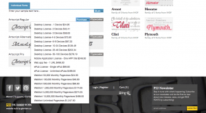
Detailed, user- and use-specific licensing on a P22 font.
If you want to use that P22 typeface in your ebooks, you’ll need to purchase an ePub License. Publishing an EPUB ebook with the font embedded without purchasing that license means you’ve infringed on P22’s license and become liable with exposure potentially far greater than the cost of the license. The same is true if you purchase the $24.95 Webfont 50,000 Monthly Pageviews license and use Artscript Pro Regular on a website that receives more than 1 million monthly pageviews.
Each font foundry has its own licensing terms and systems. Examine those terms and systems carefully, purchase what you need, and maintain compliance within your organization to stay on the right side of the law.
Share Fonts with Your Team
After choosing and licensing your brand type families, you need to make sure your entire team has access to those fonts. Again, one of the primary functions of a system like Universal Type Server is to share fonts to team members’ desktop and laptop computers. For small teams, a cloud-enabled font sharing tool such as Suitcase TeamSync can be used to share fonts without the need to install any server hardware or software. You will need a clearly communicated font handling and compliance policy as Suitcase TeamSync doesn’t manage license compliance like Universal Type Server. Suitcase TeamSync uses Suitcase Fusion as the client, so if you’re already familiar with the single-user font manager, there isn’t any learning curve. Suitcase TeamSync ensures that fonts sync between a user’s different systems, ensuring that fonts used on your desktop Mac, for example, are available and activated on your Microsoft Surface Pro as well as on your teammates’ machines. (see Figure 5).
The icons of the top four font sets in Suitcase Fusion indicate that they’re synchronized between the user’s systems via TypeSync.
Communicate Typeface Usage
In the final segment of the Creating a Branding Guide series, Part 6: “Building a Brand Style Guide for All Media,” you’ll learn to create a brand style guide starting from scratch or the free brand style guide template I provide. At that time, you’ll communicate your brand’s font usage guidelines, including when to use each type family and the individual faces within it. In the meantime, Figure 6 is a sample page from the typography guidelines common in brand style guides.
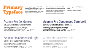
A typefaces page from a typical brand style guide.
In the Next Installment
In Creating a Branding Guide Part 5: “Using Photography, Imagery, and Video in Your Brand,” we will explore common images and photography used to establish a brand, including the use of models and spokesmodels. You will be introduced to the legal considerations of properly licensing imagery and of obtaining model releases when applicable. Using examples from popular stock photography and stock footage sites, you will learn to understand and know when to choose from royalty-free, rights-managed, and public domain photos, images, and video clips. You will also learn strategies for documenting image and video licenses, and for controlling and managing the assets themselves.
Want to know more about how to improve your overall brand strategy? Start by creating your own top-notch brand style guide. Download our step-by-step guide here.
About the Author
Pariah Burke (Twitter: @iampariah) is a consultant, trainer, speaker, and the author of numerous books, video courses, and articles covering InDesign, InCopy, Photoshop, Illustrator, Acrobat, typography, asset management, epublishing, and the business of design. He is an Adobe Community Professional, an Evernote Certified Consultant, and an advisor to Adobe and other companies. He lives in Portland, Oregon.